密码强度
平时我们在浏览各种网站和 APP 的时候,都接触过密码这个东西~
密码设置的好不好,关乎到你的账号安全性,越复杂的密码越安全,所以密码强度很重要,而我们在做注册功能的时候,也有责任去帮协助用户设置一个高密码强度的密码~
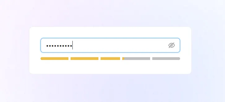
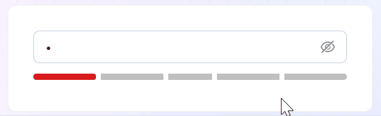
那么密码强度怎么计算呢? 且应该如何实现以下这样的密码强度动画展示效果呢?

思路
其实思路很简单:
(1) 监听密码输入框的变化
(2) 密码变化时,获取密码文本,并通过某种方式计算这个密码的强度分数
(3) 根据强度分数,改变下方块的颜色和宽度
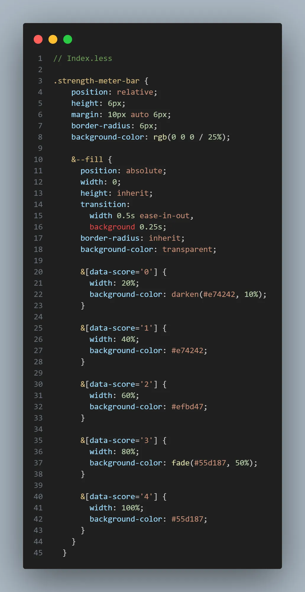
- 0分:强度低,红色,宽度 20%
- 1分:强度低,红色,宽度 40%
- 2分:强度中,橙色,宽度 60%
- 3分:强度高,绿色,宽度 80%
- 4分:强度高,绿色,宽度 100%
计算密码强度分数
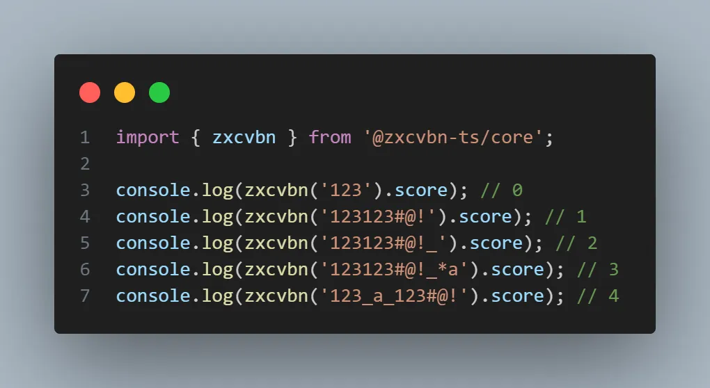
用什么方式去计算密码强度方式呢?我们可以用 @zxcvbn-ts/core这个库来计算~
@zxcvbn-ts/core 是 zxcvbn 密码强度估计器的 TypeScript 实现版本,用于帮助开发者评估用户设置密码的复杂度和安全性,计算的依据有:
- 密码长度: 越长分数越高
- 字符类型: 数字、字母、符号
- 词典攻击检测: 内置词典列表,检测密码强度
- 评分系统: 0-4分,分数越高越安全
- 熵计算: 评测密码所需尝试次数,熵越高,分数越高
密码强度动画展示效果
计算了分数之后,我们需要根据分数去展示:
- 不同的颜色
- 不同的宽度
我们可以使用属性选择器的方式,去完成这一个效果,看以下代码~
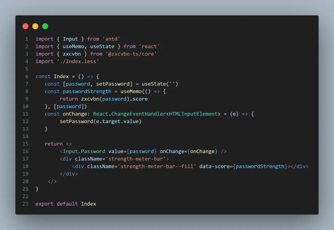
当密码改变的时候,会实时计算密码强度分数,这也就是意味着 data-score 这个属性会一直变,接着我们可以在样式中,去根据属性选择器去设置不同的颜色和宽度
现在可以看到这样的效果

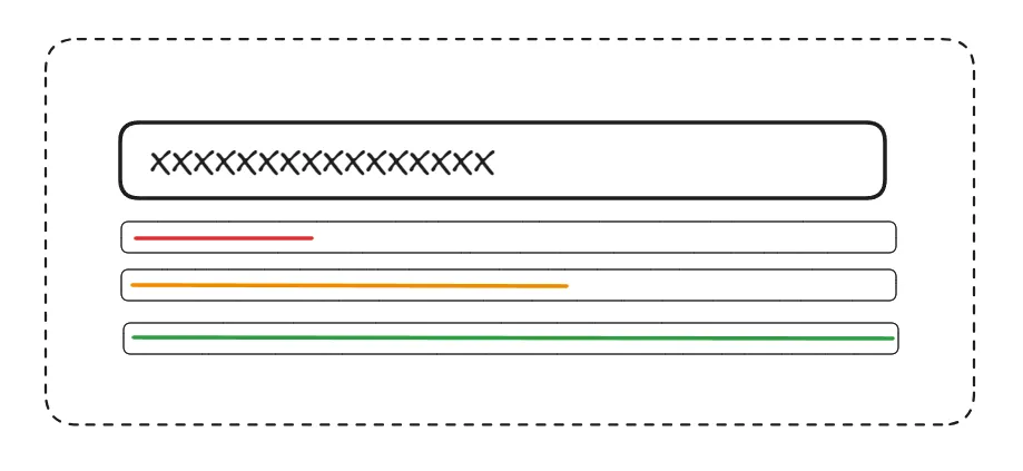
完善动画效果
但是我们如果想实现分格的效果,可以借助伪元素去做~
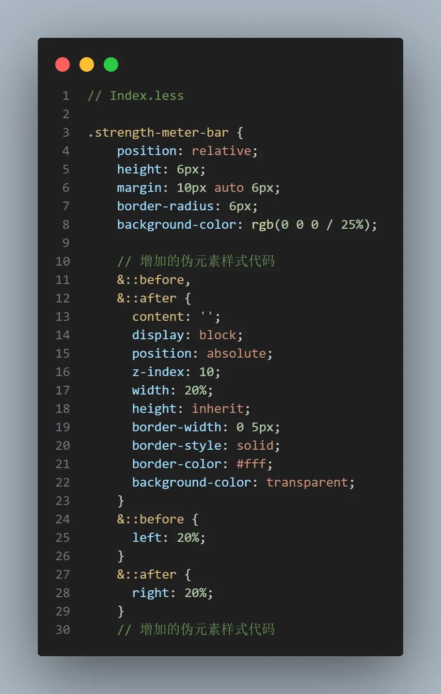
现在可以达到我们期望的效果~
完整代码