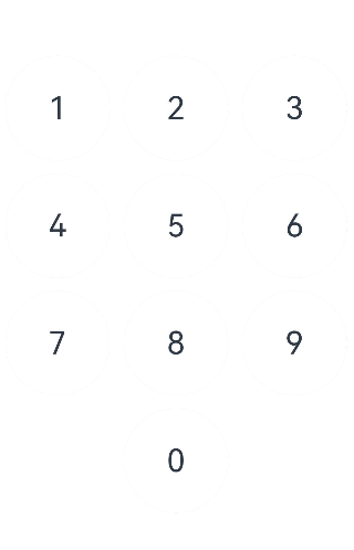
效果呈现
本例最终效果图如下:
环境要求
本例基于以下环境开发,开发者也可以基于其他适配的版本进行开发:
- IDE: DevEco Studio 3.1 Beta2
- SDK: Ohos_sdk_public 3.2.11.9(API Version 9 Release)
实现思路
本实例涉及到的主要特性及其实现方案如下:
- UI框架:使用Grid,GridItem等容器组件组建UI框架。
- 按钮渲染:通过自定义numBtn组件(含Column、Button、Stack、Text等关键组件以及visibility属性),进行数字按钮的渲染。
- 按钮状态变化:设置状态变量unPressed,控制按钮的当前状态,向Column组件添加onTouch事件,监听按钮的当前状态。
- 默认状态为按钮放开状态(unPressed为true)。
- 当按钮按下时,更新按钮的状态(unPressed:true -> false)。
- 当按钮放开时,更新按钮的状态(unPressed:false -> true)。
- 按钮动画展示:使用属性动画以及组件内转场动画绘制按钮不同状态下的动画。
- 当按钮按下时,使用显式动画(animateTo)加载动画:插入按下时的Row组件,同时加载水波的聚拢效果。
- 当按钮放开时,使用组件内转场加载动画:插入放开时的Row组件,同时加载水波的扩散效果。
开发步骤
针对实现思路中所提到的内容,具体关键开发步骤如下:
先通过Grid,GridItem等容器组件将UI框架搭建起来,在GuidItem中引用步骤2中的自定义数字按钮numBtn构建出数字栅格。
具体代码如下:
private numGrid: number[] = [1, 2, 3, 4, 5, 6, 7, 8, 9, -1, 0, -1]
  ...
    Column() {
      Grid() {
        ForEach(this.numGrid, (item: number, index: number) => {
          GridItem() {
            ...
          }
        }, item => item)
      }
      .columnsTemplate('1fr 1fr 1fr')
      .rowsTemplate('1fr 1fr 1fr 1fr')
      .columnsGap(10)
      .rowsGap(10)
      .width(330)
      .height(440)
}.width('100%').height('100%')- 1.
- 2.
- 3.
- 4.
- 5.
- 6.
- 7.
- 8.
- 9.
- 10.
- 11.
- 12.
- 13.
- 14.
- 15.
- 16.
- 17.
通过Column、Button、Stack、Text等关键组件以及visibility属性构建自定义数字按钮numBtn。
具体代码如下:
@Component
struct numBtn {
  ···
  build() {
    Column() {
        Button() {
            stack(){
                ...
                Text(`${this.item}`).fontSize(30)
            }
            ...
        }
        .backgroundColor('#ccc')
        .type(ButtonType.Circle)
        .borderRadius(100)
        .width(100)
        .height(100)
    }
    .visibility(this.item == -1 ? Visibility.Hidden : Visibility.Visible)
    .borderRadius(100)
  }
}- 1.
- 2.
- 3.
- 4.
- 5.
- 6.
- 7.
- 8.
- 9.
- 10.
- 11.
- 12.
- 13.
- 14.
- 15.
- 16.
- 17.
- 18.
- 19.
- 20.
- 21.
- 22.
设置状态变量unPressed,监听当前数字按钮的状态,同时向Column组件添加onTouch事件,获取并更新按钮的当前状态,从而可以根据监听到的按钮状态加载对应的动画效果。
具体代码块如下:
//状态变量unPressed,用于监听按钮按下和放开的状态
@State unPressed: boolean = true
...
// 添加onTouch事件,监听状态
.onTouch((event: TouchEvent) => {
  // 当按钮按下时,更新按钮的状态(unPressed:true -> false)
  if (event.type == TouchType.Down) {
    animateTo({ duration: 400 }, () => {
      this.unPressed = !this.unPressed
      this.currIndex = this.index
    })
  }
  // 当按钮放开时,更新按钮的状态(unPressed:false -> true)
  if (event.type == TouchType.Up) {
    animateTo({ duration: 400 }, () => {
      this.unPressed = !this.unPressed
    })
  }
})- 1.
- 2.
- 3.
- 4.
- 5.
- 6.
- 7.
- 8.
- 9.
- 10.
- 11.
- 12.
- 13.
- 14.
- 15.
- 16.
- 17.
- 18.
- 19.
根据按钮组件的按下/放开状态,通过if-else语句选择插入的Row组件,并随之呈现不同的水波动画效果(按下时水波聚拢,放开时水波扩散)。
具体代码块如下:
Stack() {
  Row() {
    // 判断当前按钮组件为放开状态
    if (this.unPressed && this.currIndex == this.index) {
      // 插入Row组件,配置过渡效果
      Row()
        .customStyle()
        .backgroundColor('#fff')
          // 水波纹扩散动画:从Row组件的中心点开始放大,scale{0,0}变更scale{1,1}(完整显示)
        .transition({
          type: TransitionType.Insert,
          opacity: 0,
          scale: { x: 0, y: 0, centerY: '50%', centerX: '50%' }
        })
    }
    // 判断当前按钮组件为按下状态
    else if (!this.unPressed && this.currIndex == this.index) {
      // 插入Row组件,配置过渡效果
      Row()
        .customStyle()
        .backgroundColor(this.btnColor)
        .scale(this.btnScale)
        .onAppear(() => {
          // 水波纹聚拢动画:Row组件backgroundColor属性变更(#ccc -> #fff),插入动画过渡效果,scale{1,1}(完整显示)变化为scale{0,0}
          animateTo({ duration: 300,
            // 聚拢动画播放完成后,需要衔接扩散动画,Row组件backgroundColor属性变更(#fff -> #ccc),插入动画过渡效果,scale{0,0}变化为scale{1,1}(完整显示)
            onFinish: () => {
              this.btnColor = '#ccc'
              this.btnScale = { x: 1, y: 1 }
            } },
            () => {
              this.btnColor = '#fff'
              this.btnScale = { x: 0, y: 0 }
            })
        })
    }
    // 其他状态
    else {
      Row()
        .customStyle()
        .backgroundColor('#fff')
    }
  }
  .justifyContent(FlexAlign.Center)
  .alignItems(VerticalAlign.Center)
  .borderRadius(100)
  Text(`${this.item}`).fontSize(30)
}
.customStyle()- 1.
- 2.
- 3.
- 4.
- 5.
- 6.
- 7.
- 8.
- 9.
- 10.
- 11.
- 12.
- 13.
- 14.
- 15.
- 16.
- 17.
- 18.
- 19.
- 20.
- 21.
- 22.
- 23.
- 24.
- 25.
- 26.
- 27.
- 28.
- 29.
- 30.
- 31.
- 32.
- 33.
- 34.
- 35.
- 36.
- 37.
- 38.
- 39.
- 40.
- 41.
- 42.
- 43.
- 44.
- 45.
- 46.
- 47.
- 48.
- 49.
完整代码
示例代码如下:
@Entry
@Component
export default struct dragFire {
  private numGrid: number[] = [1, 2, 3, 4, 5, 6, 7, 8, 9, -1, 0, -1]

  build() {
    Column() {
      Grid() {
        ForEach(this.numGrid, (item: number, index: number) => {
          GridItem() {
            numBtn({ item: item, index: index })
          }
        }, item => item)
      }
      .columnsTemplate('1fr 1fr 1fr')
      .rowsTemplate('1fr 1fr 1fr 1fr')
      .columnsGap(10)
      .rowsGap(10)
      .width(330)
      .height(440)
    }.width('100%').height('100%')
  }
}


@Component
struct numBtn {
  private currIndex: number = -1
  //状态变量unPressed,用于控制按钮的状态
  @State unPressed: boolean = true
  @State btnColor: string = '#ccc'
  index: number
  item: number
  @State btnScale: {
    x: number,
    y: number
  } = { x: 1, y: 1 }

  @Styles customStyle(){
    .width('100%')
    .height('100%')
    .borderRadius(100)
  }

  build() {
    Column() {
      Button() {
        Stack() {
          Row() {
            // 判断当前组件为放开状态
            if (this.unPressed && this.currIndex == this.index) {
              // 插入Row组件,配置过渡效果
              Row()
                .customStyle()
                .backgroundColor('#fff')
                  // 水波纹扩散动画:Row组件backgroundColor属性变更(#fff -> #ccc),系统插入动画过渡效果,从组建的中心点开始放大,scale{0,0}变更scale{1,1}
                .transition({
                  type: TransitionType.Insert,
                  opacity: 0,
                  scale: { x: 0, y: 0, centerY: '50%', centerX: '50%' }
                })
            }
            // 判断当前组件为按下状态
            else if (!this.unPressed && this.currIndex == this.index) {
              // 插入Row组件,配置过渡效果
              Row()
                .customStyle()
                .backgroundColor(this.btnColor)
                .scale(this.btnScale)
                .onAppear(() => {
                  // 水波纹聚拢动画:Row组件backgroundColor属性变更(#ccc -> #fff),插入动画过渡效果,scale{1,1}变化为scale{0,0}
                  animateTo({ duration: 300,
                    // 聚拢动画播放完成后,需要衔接扩散动画,此时Row组件backgroundColor属性变更(#fff -> #ccc),插入动画过渡效果,scale{0,0}变化为scale{1,1}
                    onFinish: () => {
                      this.btnColor = '#ccc'
                      this.btnScale = { x: 1, y: 1 }
                    } },
                    () => {
                      this.btnColor = '#fff'
                      this.btnScale = { x: 0, y: 0 }
                    })
                })
            }
            // 其他状态
            else {
              Row()
                .customStyle()
                .backgroundColor('#fff')
            }
          }
          .justifyContent(FlexAlign.Center)
          .alignItems(VerticalAlign.Center)
          .borderRadius(100)

          Text(`${this.item}`).fontSize(30)
        }
        .customStyle()
      }
      .stateEffect(false)
      .backgroundColor('#ccc')
      .type(ButtonType.Circle)
      .borderRadius(100)
      .width(100)
      .height(100)
    }
    .visibility(this.item == -1 ? Visibility.Hidden : Visibility.Visible)
    .borderRadius(100)
    // onTouch事件,监听状态
    .onTouch((event: TouchEvent) => {
      // 当按钮按下时,更新按钮的状态(unPressed:true -> false)
      if (event.type == TouchType.Down) {
        animateTo({ duration: 400 }, () => {
          this.unPressed = !this.unPressed
          this.currIndex = this.index
        })
      }
      // 当按钮放开时,更新按钮的状态(unPressed:false -> true)
      if (event.type == TouchType.Up) {
        animateTo({ duration: 400 }, () => {
          this.unPressed = !this.unPressed
        })
      }
    })
  }
}- 1.
- 2.
- 3.
- 4.
- 5.
- 6.
- 7.
- 8.
- 9.
- 10.
- 11.
- 12.
- 13.
- 14.
- 15.
- 16.
- 17.
- 18.
- 19.
- 20.
- 21.
- 22.
- 23.
- 24.
- 25.
- 26.
- 27.
- 28.
- 29.
- 30.
- 31.
- 32.
- 33.
- 34.
- 35.
- 36.
- 37.
- 38.
- 39.
- 40.
- 41.
- 42.
- 43.
- 44.
- 45.
- 46.
- 47.
- 48.
- 49.
- 50.
- 51.
- 52.
- 53.
- 54.
- 55.
- 56.
- 57.
- 58.
- 59.
- 60.
- 61.
- 62.
- 63.
- 64.
- 65.
- 66.
- 67.
- 68.
- 69.
- 70.
- 71.
- 72.
- 73.
- 74.
- 75.
- 76.
- 77.
- 78.
- 79.
- 80.
- 81.
- 82.
- 83.
- 84.
- 85.
- 86.
- 87.
- 88.
- 89.
- 90.
- 91.
- 92.
- 93.
- 94.
- 95.
- 96.
- 97.
- 98.
- 99.
- 100.
- 101.
- 102.
- 103.
- 104.
- 105.
- 106.
- 107.
- 108.
- 109.
- 110.
- 111.
- 112.
- 113.
- 114.
- 115.
- 116.
- 117.
- 118.
- 119.
- 120.
- 121.
- 122.
- 123.
- 124.
- 125.