最近创作灵感匮乏, 来 CodePen 上找找灵感, 同时也给同样需要获取灵感的 coder (程序员们)带来一点点想象空间。

首先分享一下 CodePen demo 集合网址:
- https://codepen.io/spark
1、像素背景
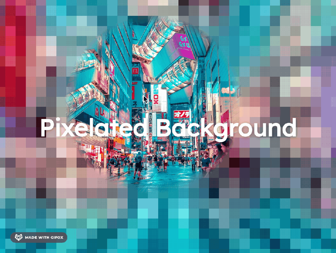
这是 Wakana Y.K. 的一个巧妙的技巧:将图像的低分辨率版本放在顶部,并将其扩展以占据与原始图像相同的大小,使浏览器对其进行像素化。然后,悬停时的蒙版(使用 JS 更新位置)完成剩下的工作。巧妙而有效。
css代码如下:
@import url("https://fonts.googleapis.com/css2?family=Lexend:wght@400&display=swap");
:root {
  --x: 50%;
  --y: 50%;
  --radius: 30vmin;
  --blur: 3vmax;
}
* {
  margin: 0;
  padding: 0;
  box-sizing: border-box;
}
html,
body {
  background-color: black;
  overscroll-behavior-x: none;
  overscroll-behavior-y: none;
  overflow: hidden;
}
body {
  width: 100vw;
  height: 100vh;
  font-family: "Lexend", serif;
  text-align: center;
  line-height: 1;
  display: flex;
  justify-content: center;
  align-items: center;
}
main {
  z-index: 1;
}
h1 {
  font-size: 7vw;
  color: white;
  text-shadow: 1px 1px 1vw rgba(0, 0, 0, 0.3);
}
#bg {
  position: absolute;
  top: 0;
  left: 0;
  width: 100vw;
  height: 100vh;
}
#bg img {
  position: absolute;
  top: 0;
  left: 0;
  width: 100%;
  height: 100%;
  object-fit: cover;
  object-position: center center;
  pointer-events: none;
  -webkit-user-select: none;
  user-select: none;
}
#bg_focus {
  mask-image: radial-gradient(
    circle 50vmin at var(--x) var(--y),
    black var(--radius),
    transparent calc(var(--radius) + var(--blur)),
    transparent
  );
}
#bg_pixelate {
  image-rendering: pixelated;
}
/*
#bg img:nth-of-type(2) {
  filter: hue-rotate(50deg);
  animation-name: animation;
  animation-duration: 0.5s;
  animation-iteration-count: infinite;
  animation-timing-function: linear;
  animation-direction: alternate;
}
@keyframes animation {
  0% {
    opacity: 0;
  }
  100% {
    opacity: 1;
  }
}
*/- 1.
- 2.
- 3.
- 4.
- 5.
- 6.
- 7.
- 8.
- 9.
- 10.
- 11.
- 12.
- 13.
- 14.
- 15.
- 16.
- 17.
- 18.
- 19.
- 20.
- 21.
- 22.
- 23.
- 24.
- 25.
- 26.
- 27.
- 28.
- 29.
- 30.
- 31.
- 32.
- 33.
- 34.
- 35.
- 36.
- 37.
- 38.
- 39.
- 40.
- 41.
- 42.
- 43.
- 44.
- 45.
- 46.
- 47.
- 48.
- 49.
- 50.
- 51.
- 52.
- 53.
- 54.
- 55.
- 56.
- 57.
- 58.
- 59.
- 60.
- 61.
- 62.
- 63.
- 64.
- 65.
- 66.
- 67.
- 68.
- 69.
- 70.
- 71.
- 72.
- 73.
- 74.
- 75.
- 76.
- 77.
- 78.
- 79.
- 80.
- 81.
- 82.
- 83.
- 84.
- 85.
2、烟火特效

用技术复原童年的烟火味, css代码:
<css-doodle click-to-update><style>
  @grid: 30 / 60vmin noclip;
  border-radius: 50%;
  background: hsl(@y(* -12), 80%, 60%);
  background: lch(90, 120, @y(*10deg));
  animation: f @once.p(5s, 7.5s) ease infinite;
  animation-delay: $s(-90/@I*@i(-1)*@x/@y);
  @keyframes f {
    0%, 25%, 80% {opacity: 1; scale: .2}
    25%, 75%, 100% {opacity: 0; scale: @r(2, 3)}
  }
</style></css-doodle>- 1.
- 2.
- 3.
- 4.
- 5.
- 6.
- 7.
- 8.
- 9.
- 10.
- 11.
- 12.
3、动态模糊
Tom Hinton 的这个演示吸引我的是它看起来多么随机和奇怪(以一种好的方式)(这在 Tom 的艺术作品中相对常见。ThreeJS 中着色器和网格的组合。
js 代码如下:
let camera, scene, renderer, clock;
let uniforms;

function init() {
  const container = document.getElementById("shader");

  clock = new THREE.Clock();
  camera = new THREE.Camera();
  camera.position.z = 1;

  scene = new THREE.Scene();

  const geometry = new THREE.PlaneBufferGeometry(2, 2);

    const texture = new THREE.TextureLoader().load( 'https://upload.wikimedia.org/wikipedia/commons/8/84/Male_and_female_chicken_sitting_together.jpg' );

  uniforms = {
    u_time: { type: "f", value: 1.0 },
    u_resolution: { type: "v2", value: new THREE.Vector2() },
    uTexture: {
      value: texture
    }
  };

  const material = new THREE.ShaderMaterial({
    uniforms,
    vertexShader: document.getElementById("vertex").textContent,
    fragmentShader: document.getElementById("fragment").textContent
  });

  material.transparent = true

  const mesh = new THREE.Mesh(geometry, material);
  scene.add(mesh);

  renderer = new THREE.WebGLRenderer({alpha: true});
  renderer.setPixelRatio(window.devicePixelRatio);

  container.appendChild(renderer.domElement);

  onWindowResize();
  window.addEventListener("resize", onWindowResize);
}

function onWindowResize() {
  renderer.setSize(window.innerWidth, window.innerHeight);
  uniforms.u_resolution.value.x = renderer.domElement.width;
  uniforms.u_resolution.value.y = renderer.domElement.height;
}

function render() {
  uniforms.u_time.value = clock.getElapsedTime();
  renderer.render(scene, camera);
}

function animate() {
  render();
  requestAnimationFrame(animate);
}

init();
animate();- 1.
- 2.
- 3.
- 4.
- 5.
- 6.
- 7.
- 8.
- 9.
- 10.
- 11.
- 12.
- 13.
- 14.
- 15.
- 16.
- 17.
- 18.
- 19.
- 20.
- 21.
- 22.
- 23.
- 24.
- 25.
- 26.
- 27.
- 28.
- 29.
- 30.
- 31.
- 32.
- 33.
- 34.
- 35.
- 36.
- 37.
- 38.
- 39.
- 40.
- 41.
- 42.
- 43.
- 44.
- 45.
- 46.
- 47.
- 48.
- 49.
- 50.
- 51.
- 52.
- 53.
- 54.
- 55.
- 56.
- 57.
- 58.
- 59.
- 60.
- 61.
- 62.
4、雪球圣诞树
Amit Sheen 在 YouTube 上直播了整个过程(您仍然可以在他的频道上观看),让每个人都了解如何使用 HTML 和 CSS 创建这棵 3D 外观的圣诞树。
css代码:
*, *::before, *::after {
    padding: 0;
    margin: 0 auto;
    box-sizing: border-box;
}

body {
  background-color: #001;
  color: #fff;
  min-height: 100vh;
  display: grid;
  place-items: center;
  perspective: 1000px;
  overflow: hidden;

  * {
    transform-style: preserve-3d;
  }
}

$srDuration: 120s;
$flDuration: 12s;

.scene {
  position: relative;
  animation: sceneRotate $srDuration infinite linear;

  @keyframes sceneRotate {
    to { rotate: y 1turn; }
  }

  * { position: absolute; }
}

.floor {
  inset: -100em;
  background-color: green;
  transform: rotateX(-90deg) translateZ(15em);
  background-image:
    radial-gradient(closest-side, transparent, #001),
    radial-gradient(closest-side, #000, transparent 15em),
    repeating-linear-gradient(#fff2 0, transparent, #fff2 2em),
    repeating-linear-gradient(90deg, #fff2 0, transparent, #fff2 2em)
    ;
}

.snowglobe {
  cursor: pointer;
  animation: var(--animation, snowglobe) $flDuration;

  @keyframes snowglobe {
    0%, 100% { pointer-events: none; }
  }

  &:active {
    --animation: none;
  }
}

.text {
  top: -20em;
  animation: sceneRotate $srDuration infinite linear reverse;

  i {
    font-size: 3em;
    width: max-content;
    translate: -50%;
    animation: var(--animation, text) $flDuration ease-in-out;

    @keyframes text {
      0%, 95% { opacity: 0; }
      100% { opacity: 1; }
    }
  }
}

.base {
  transform: translateY(11em);

  i {
    inset: -10em -2.7em;
    background-color: maroon;
    background-image: radial-gradient(circle, transparent, 90%, #0007);
    transform: rotateX(-90deg) rotate(var(--angle, 0));

    @for $i from 0 to 6 {
      &:nth-child(#{$i + 1}) {
        --angle: #{$i * 30deg};
      }
    }

    &::before, &::after {
      content: '';
      position: absolute;
      width: 100%; height: 4em;
      box-shadow: 0 0 1em #0007 inset;
      background-color: inherit;
      transform-origin: top;
      transform: rotateX(90deg);
    }

    &::after { top: 100%; }
  }
}

.glass {
  inset: -15em;
  background-image: radial-gradient(farthest-side at 50% 60%, transparent, 95%, #fff5);
  border-radius: 50%;
  animation: sceneRotate $srDuration infinite linear reverse;

  &::after {
    content: '';
    position: absolute;
    inset: 2em;
    border-radius: 50%;
    background-image: radial-gradient(circle at 50% 60%, transparent 65%, #ff7a 85%);
    filter: blur(1em);
    animation: lightblur $srDuration infinite ease-in-out;

    @keyframes lightblur {
      0%, 100% { rotate: -45deg; }
      50% { rotate: 45deg; }
    }
  }
}

.tree {
  .trunk {
    inset: -7em -1em;
    transform: translateY(4em);
    background-color: brown;
    border-radius: 50% / 90% 90% 3% 3%;
    animation: sceneRotate $srDuration infinite linear reverse;
  }

  .leafs i {
    top: var(--top, 0);
    width: 8em;
    aspect-ratio: 1;
    background-image: radial-gradient(circle at top left, #000, green);
    border-radius: 0 0 100% 0;
    transform-origin: top left;
    transform: rotateY(var(--ry)) rotateX(45deg) rotateZ(45deg) scale(var(--scale, 1));

    $angle: 0;
    @for $i from 0 to 48 {
      &:nth-child(#{$i + 1}) {
        $angle: $angle + 60 + random(60);
        --top: #{-5 + $i * 0.2}em;
        --ry: #{$angle}deg;
        --scale: #{0.25 + $i / 75};
      }
    }
  }

  .lights i {
    inset: -0.4em;
    background-color: hsl(var(--hue) 100% 50%);
    background-image: radial-gradient(circle at top, transparent, #0007);
    box-shadow: 0 0 0.5em #fff7;
    transform: translatey(var(--ty)) rotateY(var(--ry, 0)) translateZ(var(--tz, 5em));
    border-radius: 50%;
    animation: lightRotate $srDuration infinite linear reverse;

    @keyframes lightRotate {
      from { transform: translatey(var(--ty)) rotateY(var(--ry, 0)) translateZ(var(--tz, 5em)) rotateY(calc(0deg - var(--ry))); }
      to { transform: translatey(var(--ty)) rotateY(var(--ry, 0)) translateZ(var(--tz, 5em)) rotateY(calc(360deg - var(--ry))); }
    }

    $angle: 0;
    @for $i from 0 to 48 {
      &:nth-child(#{$i + 1}) {
        $angle: $angle + 60 + random(60);
        --ty: #{-4 + $i * 0.25}em;
        --tz: #{1 + $i * 0.09}em;
        --ry: #{$angle}deg;
        --hue: #{random(360)};
      }
    }
  }
}

.flakes {
  transform: translateY(11em) rotateX(-90deg);
  animation: var(--animation, flakes) $flDuration ease-in-out;

  @keyframes flakes {
    0%, 100% { transform: translateY(11em) rotateX(-90deg); }
    25%, 50% { transform: translateY(0em) rotateX(-90deg); }
  }

  i {
    inset: -0.35em;
    background-color: hsl(55 100% var(--light, 100%));
    rotate: var(--rotate1);
    transform: translateX(var(--tx1));
    animation:
      var(--animation, flakeRotate) $flDuration ease-in-out,
      var(--animation, flakeTransform) $flDuration ease-in-out;

    @keyframes flakeTransform {
      0% { transform: rotateY(0deg) translateX(var(--tx1)) rotate3d(1, 1, 1, 0deg); }
      25% { transform: rotateY(var(--ry)) translateX(var(--tx2)) rotate3d(1, 1, 1, calc(var(--r3d) * 0.25)); animation-timing-function: linear; }
      50% { transform: rotateY(var(--ry)) translateX(var(--tx2)) rotate3d(1, 1, 1, calc(var(--r3d) * 0.5)); }
      100% { transform: rotateY(0deg) translateX(var(--tx1)) rotate3d(1, 1, 1, var(--r3d)); }
    }

    @keyframes flakeRotate {
      from { rotate: var(--rotate1); }
      to { rotate: var(--rotate2); }
    }

    @for $i from 0 to 256 {
      &:nth-child(#{$i + 1}) {
        $r: random(360);
        --rotate1: #{$r}deg;
        --rotate2: #{$r + 5 * 360}deg;
        --tx1: #{(random(100) / 100) * 5 + 3}em;
        --tx2: #{(random(100) / 100) * 6 + 7}em;
        --light: #{70 + random(30)}%;
        --ry: #{random(120) - 45}deg;
        --r3d: #{random(8) + 8}turn;
      }
    }
  }
}

.star {
  position: absolute;
  top: -5.5em;

  i {
    position: absolute;
    left: -1.25em;
    width: 2.5em; height: 0.5em;
    background-color: gold;
    background-image: linear-gradient(90deg, transparent, #000a);
    clip-path: polygon(0 0, 100% 0, 50% 100%);
    transform-origin: top;
    transform:
      rotate(var(--angle))
      translateY(-0.41em)
      rotateX(var(--rx, 35deg));

    &:nth-child(5n + 1) { --angle: 0deg; }
    &:nth-child(5n + 2) { --angle: 72deg; }
    &:nth-child(5n + 3) { --angle: 144deg; }
    &:nth-child(5n + 4) { --angle: 216deg; }
    &:nth-child(5n + 5) { --angle: 288deg; }

    &:nth-child(n + 6) { --rx: -35deg; }
  }
}- 1.
- 2.
- 3.
- 4.
- 5.
- 6.
- 7.
- 8.
- 9.
- 10.
- 11.
- 12.
- 13.
- 14.
- 15.
- 16.
- 17.
- 18.
- 19.
- 20.
- 21.
- 22.
- 23.
- 24.
- 25.
- 26.
- 27.
- 28.
- 29.
- 30.
- 31.
- 32.
- 33.
- 34.
- 35.
- 36.
- 37.
- 38.
- 39.
- 40.
- 41.
- 42.
- 43.
- 44.
- 45.
- 46.
- 47.
- 48.
- 49.
- 50.
- 51.
- 52.
- 53.
- 54.
- 55.
- 56.
- 57.
- 58.
- 59.
- 60.
- 61.
- 62.
- 63.
- 64.
- 65.
- 66.
- 67.
- 68.
- 69.
- 70.
- 71.
- 72.
- 73.
- 74.
- 75.
- 76.
- 77.
- 78.
- 79.
- 80.
- 81.
- 82.
- 83.
- 84.
- 85.
- 86.
- 87.
- 88.
- 89.
- 90.
- 91.
- 92.
- 93.
- 94.
- 95.
- 96.
- 97.
- 98.
- 99.
- 100.
- 101.
- 102.
- 103.
- 104.
- 105.
- 106.
- 107.
- 108.
- 109.
- 110.
- 111.
- 112.
- 113.
- 114.
- 115.
- 116.
- 117.
- 118.
- 119.
- 120.
- 121.
- 122.
- 123.
- 124.
- 125.
- 126.
- 127.
- 128.
- 129.
- 130.
- 131.
- 132.
- 133.
- 134.
- 135.
- 136.
- 137.
- 138.
- 139.
- 140.
- 141.
- 142.
- 143.
- 144.
- 145.
- 146.
- 147.
- 148.
- 149.
- 150.
- 151.
- 152.
- 153.
- 154.
- 155.
- 156.
- 157.
- 158.
- 159.
- 160.
- 161.
- 162.
- 163.
- 164.
- 165.
- 166.
- 167.
- 168.
- 169.
- 170.
- 171.
- 172.
- 173.
- 174.
- 175.
- 176.
- 177.
- 178.
- 179.
- 180.
- 181.
- 182.
- 183.
- 184.
- 185.
- 186.
- 187.
- 188.
- 189.
- 190.
- 191.
- 192.
- 193.
- 194.
- 195.
- 196.
- 197.
- 198.
- 199.
- 200.
- 201.
- 202.
- 203.
- 204.
- 205.
- 206.
- 207.
- 208.
- 209.
- 210.
- 211.
- 212.
- 213.
- 214.
- 215.
- 216.
- 217.
- 218.
- 219.
- 220.
- 221.
- 222.
- 223.
- 224.
- 225.
- 226.
- 227.
- 228.
- 229.
- 230.
- 231.
- 232.
- 233.
- 234.
- 235.
- 236.
- 237.
- 238.
- 239.
- 240.
- 241.
- 242.
- 243.
- 244.
- 245.
- 246.
- 247.
- 248.
- 249.
- 250.
- 251.
- 252.
- 253.
- 254.
5、点状旋转加载动画

这是 Josetxu 用 HTML 和 CSS 创建的催眠加载器。一个有趣的动画组合创造了这种效果,点在改变大小(和 z 索引)的同时移动。
css代码:
:root {
  --w: #fafafa;
  --b: #141414;
  --s: 1s;
  --d: calc(var(--s) / 6);
}

$d: var(--d);

* {
  box-sizing: border-box;
}

body {
  margin: 0;
  padding: 0;
  width: 100vw;
  height: 100vh;
  overflow: hidden;
}

input {
  width: 100vw;
  height: 100vh;
  position: absolute;
  z-index: 4;
  opacity: 0;
  cursor: pointer;
  &:checked ~ div {
    filter: invert(1);
  }
  &:checked + .bg:before {
    content: "CLICK TO DARK";
  }
}

.bg:before {
  content: "CLICK TO LIGHT";
  position: absolute;
  color: var(--w);
  width: 100%;
  text-align: center;
  bottom: 10vh;
  font-family: Arial, Helvetica, serif;
  font-size: 12px;
  text-shadow: 0 0 1px var(--w);
  opacity: 0.25;
}

body, .dots {
  display: flex;
  align-items: center;
  justify-content: center;
}

.bg {
  width: 100vw;
  height: 100vh;
  position: absolute;
  background: var(--b);
  z-index: -2;
}

.dots {
  width: 50vmin;
  height: 50vmin;
  position: relative;
}

.ring {
  border: 1.5vmin solid var(--w);
  width: 64%;
  height: 64%;
  border-radius: 100%;
  z-index: 0;
  box-shadow: 0 0 0 1vmin var(--b), 0 0 0 1vmin var(--b) inset;
}

.dot {
  width: 50%;
  position: absolute;
  height: 7vmin;
  left: 0;
  transform-origin: 100% 50%;
  z-index: -1;
  animation:
    over-ring calc(var(--s) * 2) linear 0s infinite,
    spin calc(var(--s) * 8) linear 0s infinite;
  &:before {
    content: "";
    width: 5.5vmin;
    height: 5.5vmin;
    left: 0;
    box-sizing: border-box;
    border: 1vmin solid var(--b);
    position: absolute;
    background: var(--w);
    border-radius: 100%;
    animation: ball var(--s) ease-in-out 0s infinite alternate;
  }
  @for $i from 1 through 12 {
    &:nth-child(#{$i}) {
      $n: (($i - 1) * -1);
      $n4: ($n * 4);
      animation-delay: calc(#{$d} * #{$n}), calc(#{$d} * #{$n4});
      &:before {
        animation-delay: calc(#{$d} * #{$n});
      }
    }
  }
}

@keyframes spin {
  100% { transform: rotate(-360deg); }
}

@keyframes ball {
  100% { left: 12vmin; width: 4vmin; height: 4vmin; }
}

@keyframes over-ring {
  0%, 50% { z-index: -1; }
  51%, 100% { z-index: 1; }
}- 1.
- 2.
- 3.
- 4.
- 5.
- 6.
- 7.
- 8.
- 9.
- 10.
- 11.
- 12.
- 13.
- 14.
- 15.
- 16.
- 17.
- 18.
- 19.
- 20.
- 21.
- 22.
- 23.
- 24.
- 25.
- 26.
- 27.
- 28.
- 29.
- 30.
- 31.
- 32.
- 33.
- 34.
- 35.
- 36.
- 37.
- 38.
- 39.
- 40.
- 41.
- 42.
- 43.
- 44.
- 45.
- 46.
- 47.
- 48.
- 49.
- 50.
- 51.
- 52.
- 53.
- 54.
- 55.
- 56.
- 57.
- 58.
- 59.
- 60.
- 61.
- 62.
- 63.
- 64.
- 65.
- 66.
- 67.
- 68.
- 69.
- 70.
- 71.
- 72.
- 73.
- 74.
- 75.
- 76.
- 77.
- 78.
- 79.
- 80.
- 81.
- 82.
- 83.
- 84.
- 85.
- 86.
- 87.
- 88.
- 89.
- 90.
- 91.
- 92.
- 93.
- 94.
- 95.
- 96.
- 97.
- 98.
- 99.
- 100.
- 101.
- 102.
- 103.
- 104.
- 105.
- 106.
- 107.
- 108.
- 109.
- 110.
- 111.
- 112.
- 113.
- 114.
- 115.
- 116.
- 117.
- 118.
- 119.
- 120.
- 121.
- 122.
- 123.
- 124.
6、Wow 冬季毯子

另一个带有 ThreeJS 和着色器的演示。这次是安娜·禅恩·清道夫(Anna Zenn Scavenger)的作品。这是 CodePen 每周关于对立面挑战的一部分。将鼠标移到毯子上以查看其平稳移动。
js代码:
import * as THREE from 'https://unpkg.com/three@0.118.3/build/three.module.js';

let container, scene, camera, renderer;
let blanket;

// LANDSCAPE / PORTRAIT

let isMobile = /(Android|iPhone|iOS|iPod|iPad)/i.test(navigator.userAgent);
let windowRatio = window.innerWidth / window.innerHeight;
let isLandscape = (windowRatio > 1) ? true : false;

// MOUSE

let isMouseMove = false;
let mouseX = 0;

const clock = new THREE.Clock();

init();
render();

function init() {

  container = document.querySelector("#scene-container");

  scene = new THREE.Scene();

  initCamera();
  initLights();
  initRenderer();

  initBlanket();

  window.addEventListener('resize', onWindowResize, false);
  document.addEventListener('mousemove', onMouseMove);
  document.addEventListener('touchmove', onTouchMove);
  window.addEventListener('mouseout', onMouseLeave);

}

function initCamera() {

  camera = new THREE.PerspectiveCamera(40, window.innerWidth / window.innerHeight, 1, 1000);
  camera.position.set(0, 2.0, 10.0);
  camera.position.z = (windowRatio > 2) ? ((5 / windowRatio) + 9) : (15 / windowRatio);

}

function initLights() {

  const dirLight = new THREE.DirectionalLight(0xffffff, 0.75);
  dirLight.position.set(-0.5, 10, -10);
  scene.add(dirLight);

  const ambientLight = new THREE.AmbientLight(0xffffff, 0.6);
  //ambientLight.position.set(0.5, 10, -5);
  scene.add(ambientLight);

}

function initRenderer() {

  renderer = new THREE.WebGLRenderer({alpha: true, antialias: true });
  // renderer.setPixelRatio(window.devicePixelRatio > 1.4 ? Math.min(window.devicePixelRatio, 1.25) : Math.min(window.devicePixelRatio, 1.25));
  renderer.setSize(window.innerWidth, window.innerHeight);
  //renderer.outputColorSpace = THREE.SRGBColorSpace;
  container.appendChild(renderer.domElement);

}

function initBlanket() {

  const SIZE = 6.5;
  const RESOLUTION = 75;

  const geometry = new THREE.PlaneBufferGeometry(SIZE, SIZE, RESOLUTION, RESOLUTION);
  geometry.rotateX(-0.5 * Math.PI);

  const tartanMaterial = new THREE.ShaderMaterial({

    lights: true,
    side: THREE.DoubleSide,

    extensions: {
      derivatives: true,
    },

    defines: {
      STANDARD: '',
      PHYSICAL: '',
    },

    uniforms: {

      ...THREE.ShaderLib.physical.uniforms,
      roughness: { value: 0.0 },
      diffuse: {value: new THREE.Color(0xffffff)},
      time: { value: 0.0 },
      amplitude: { value: 0.4 },
      frequency: { value: 0.4 },
      speed: { value: 0.3 },
      u_time: { value: 0.0 },
      u_resolution: { value: new THREE.Vector2(window.innerWidth, window.innerHeight) }

    },

    vertexShader: monkeyPatch(THREE.ShaderChunk.meshphysical_vert, {

      header: `
        uniform float time;
        uniform float amplitude;
        uniform float speed;
        uniform float frequency;

        varying vec2 vUv;

        ${noise()}

        float displace(vec3 point) {
          return noise(vec3(point.x * frequency, point.z * frequency, time * speed)) * amplitude;
        }

        // http://lolengine.net/blog/2013/09/21/picking-orthogonal-vector-combing-coconuts
        vec3 orthogonal(vec3 v) {
          return normalize(abs(v.x) > abs(v.z) ? vec3(-v.y, v.x, 0.0)
        : vec3(0.0, -v.z, v.y));
        }
      `,
      // adapted from http://tonfilm.blogspot.com/2007/01/calculate-normals-in-shader.html
      main: `
        vec3 displacedPosition = position + normal * displace(position);

        float offset = ${SIZE / RESOLUTION};
        vec3 tangent = orthogonal(normal);
        vec3 bitangent = normalize(cross(normal, tangent));
        vec3 neighbour1 = position + tangent * offset;
        vec3 neighbour2 = position + bitangent * offset;
        vec3 displacedNeighbour1 = neighbour1 + normal * displace(neighbour1);
        vec3 displacedNeighbour2 = neighbour2 + normal * displace(neighbour2);

        // https://i.ya-webdesign.com/images/vector-normals-tangent-16.png
        vec3 displacedTangent = displacedNeighbour1 - displacedPosition;
        vec3 displacedBitangent = displacedNeighbour2 - displacedPosition;

        // https://upload.wikimedia.org/wikipedia/commons/d/d2/Right_hand_rule_cross_product.svg
        vec3 displacedNormal = normalize(cross(displacedTangent, displacedBitangent));
      `,

      '#include <defaultnormal_vertex>': THREE.ShaderChunk.defaultnormal_vertex.replace(
      // transformedNormal will be used in the lighting calculations
      'vec3 transformedNormal = objectNormal;',
      `vec3 transformedNormal = displacedNormal;`
      ),

      // transformed is the output position
      '#include <morphtarget_vertex>': `vUv = uv;`,
      '#include <displacementmap_vertex>': `
        transformed = displacedPosition;
      `,
    }),

    fragmentShader: monkeyPatch(THREE.ShaderChunk.meshphysical_frag, {

      header: `

        #define FREQUENCY 40
        #define TILT -60
        #define PATTERN 0.7

        varying vec2 vUv;
        uniform vec2 u_resolution;

        float coordinateGrid(vec2 r, float lineWidth, float offset, bool doubleLine) {

          float pixel = 0.0;

  for(float i = 0.0; i < 2.0; i += PATTERN) {

        float x = mod(i, PATTERN * 2.0);

        if (doubleLine) {

            if (x == 0.0) {
                pixel += 1.0 - step(lineWidth, abs(r.x - i - offset)); //first x line
                pixel += 1.0 - step(lineWidth, abs(r.y - i + offset)); //first y line
            } else {
                pixel += 1.0 - step(lineWidth, abs(r.x - i + offset)); //second x line
                pixel += 1.0 - step(lineWidth, abs(r.y - i - offset)); //second y line
            }

        } else {
            pixel += 1.0 - step(lineWidth, abs(r.x - i*2.0 - offset)); //first x line
            pixel += 1.0 - step(lineWidth, abs(r.y - i*2.0 + offset)); //first y line
        }
  }

  return pixel;
}
    `,
    main: ``,
    '#include <logdepthbuf_fragment>': `

    vec2 r = vUv;

    vec4 lightred = vec4(220.0/255.0, 23.0/255.0, 10.0/255.0, 1.0);
    vec4 darkRed = vec4(120.0/255.0, 12.0/255.0, 30.0/255.0, 1.0);
    vec4 yellow = vec4(190.0/255.0, 170.0/255.0, 59.0/255.0, 1.0);
    vec4 white = vec4(242.0/255.0, 242.0/255.0, 203.0/255.0, 0.1);
    vec4 blue = vec4(5.0/255.0, 10.0/255.0, 0.0/255.0, 0.8);
    vec4 purp = vec4(0.0/255.0, 0.0/255.0, 0.0/255.0, 0.9);

    vec4 pixel = lightred; // bg color

    pixel = mix(pixel, darkRed, coordinateGrid(r, 0.15, 0.0, true)); //paired line
    pixel = mix(pixel, white, coordinateGrid(r, 0.01, 0.005, true)); //paired line
    pixel = mix(pixel, white, coordinateGrid(r, 0.01, -0.35, false)); //paired line
    pixel = mix(pixel, purp, coordinateGrid(r, 0.01, -0.4, false)); //single line
    pixel = mix(pixel, purp, coordinateGrid(r, 0.01, -0.3, false)); //single line
    pixel = mix(pixel, blue, coordinateGrid(r, 0.02, 0.15, true)); //paired line
    pixel = mix(pixel, yellow, coordinateGrid(r, 0.01, 0.05, true)); //paired line

    float stripe = fract( dot(r, vec2(FREQUENCY,TILT)));
    pixel = mix(pixel, darkRed, stripe);

          diffuseColor = pixel;
    `,

  })
});

  blanket = new THREE.Mesh(geometry, tartanMaterial);
  blanket.position.set(0, 2.0, -0.5);
  blanket.rotation.set(Math.PI * 0.1, Math.PI * 0.25, 0);
  scene.add(blanket);

}

function render() {

  update();
  renderer.render(scene, camera);
  requestAnimationFrame(render);

}

function update() {

  let t = clock.getDelta();

  if (isMouseMove) {

    blanket.material.uniforms.time.value = 0.1 + 3.0 * mouseX;

  } else {

    blanket.material.uniforms.time.value += 3.0 * t;

  }

}

// * UTILS *

function monkeyPatch(shader, { defines = '', header = '', main = '', ...replaces }) {

  let patchedShader = shader;

  const replaceAll = (str, find, rep) => str.split(find).join(rep);

  Object.keys(replaces).forEach((key) => {

    patchedShader = replaceAll(patchedShader, key, replaces[key])

  });

  patchedShader = patchedShader.replace(
    'void main() {',
    `
    ${header}
    void main() {
      ${main}
    `
  );

  return `
    ${defines}
    ${patchedShader}
  `

}

// * EVENTS *

function onWindowResize() {

  camera.aspect = window.innerWidth / window.innerHeight;
  camera.updateProjectionMatrix();
  renderer.setSize(window.innerWidth, window.innerHeight);

}

function onMouseMove(event) {

  mouseX = (event.clientX / window.innerWidth) * 2 - 1;
  isMouseMove = true;
  console.log(mouseX);

}

function onTouchMove(event) {

  let x = event.changedTouches[0].clientX;
  mouseX = (x / window.innerWidth) * 2 - 1;
  isMouseMove = true;

}

function onMouseLeave(event) {

  console.log('mouseleft');
  isMouseMove = false;

}- 1.
- 2.
- 3.
- 4.
- 5.
- 6.
- 7.
- 8.
- 9.
- 10.
- 11.
- 12.
- 13.
- 14.
- 15.
- 16.
- 17.
- 18.
- 19.
- 20.
- 21.
- 22.
- 23.
- 24.
- 25.
- 26.
- 27.
- 28.
- 29.
- 30.
- 31.
- 32.
- 33.
- 34.
- 35.
- 36.
- 37.
- 38.
- 39.
- 40.
- 41.
- 42.
- 43.
- 44.
- 45.
- 46.
- 47.
- 48.
- 49.
- 50.
- 51.
- 52.
- 53.
- 54.
- 55.
- 56.
- 57.
- 58.
- 59.
- 60.
- 61.
- 62.
- 63.
- 64.
- 65.
- 66.
- 67.
- 68.
- 69.
- 70.
- 71.
- 72.
- 73.
- 74.
- 75.
- 76.
- 77.
- 78.
- 79.
- 80.
- 81.
- 82.
- 83.
- 84.
- 85.
- 86.
- 87.
- 88.
- 89.
- 90.
- 91.
- 92.
- 93.
- 94.
- 95.
- 96.
- 97.
- 98.
- 99.
- 100.
- 101.
- 102.
- 103.
- 104.
- 105.
- 106.
- 107.
- 108.
- 109.
- 110.
- 111.
- 112.
- 113.
- 114.
- 115.
- 116.
- 117.
- 118.
- 119.
- 120.
- 121.
- 122.
- 123.
- 124.
- 125.
- 126.
- 127.
- 128.
- 129.
- 130.
- 131.
- 132.
- 133.
- 134.
- 135.
- 136.
- 137.
- 138.
- 139.
- 140.
- 141.
- 142.
- 143.
- 144.
- 145.
- 146.
- 147.
- 148.
- 149.
- 150.
- 151.
- 152.
- 153.
- 154.
- 155.
- 156.
- 157.
- 158.
- 159.
- 160.
- 161.
- 162.
- 163.
- 164.
- 165.
- 166.
- 167.
- 168.
- 169.
- 170.
- 171.
- 172.
- 173.
- 174.
- 175.
- 176.
- 177.
- 178.
- 179.
- 180.
- 181.
- 182.
- 183.
- 184.
- 185.
- 186.
- 187.
- 188.
- 189.
- 190.
- 191.
- 192.
- 193.
- 194.
- 195.
- 196.
- 197.
- 198.
- 199.
- 200.
- 201.
- 202.
- 203.
- 204.
- 205.
- 206.
- 207.
- 208.
- 209.
- 210.
- 211.
- 212.
- 213.
- 214.
- 215.
- 216.
- 217.
- 218.
- 219.
- 220.
- 221.
- 222.
- 223.
- 224.
- 225.
- 226.
- 227.
- 228.
- 229.
- 230.
- 231.
- 232.
- 233.
- 234.
- 235.
- 236.
- 237.
- 238.
- 239.
- 240.
- 241.
- 242.
- 243.
- 244.
- 245.
- 246.
- 247.
- 248.
- 249.
- 250.
- 251.
- 252.
- 253.
- 254.
- 255.
- 256.
- 257.
- 258.
- 259.
- 260.
- 261.
- 262.
- 263.
- 264.
- 265.
- 266.
- 267.
- 268.
- 269.
- 270.
- 271.
- 272.
- 273.
- 274.
- 275.
- 276.
- 277.
- 278.
- 279.
- 280.
- 281.
- 282.
- 283.
- 284.
- 285.
- 286.
- 287.
- 288.
- 289.
- 290.
- 291.
- 292.
- 293.
- 294.
- 295.
- 296.
- 297.
- 298.
- 299.
- 300.
- 301.
- 302.
- 303.
- 304.
- 305.
- 306.
- 307.
- 308.
- 309.
- 310.
- 311.
- 312.
- 313.
- 314.
- 315.
- 316.
- 317.
- 318.
- 319.
- 320.
- 321.
- 322.
- 323.
最后
下周我会继续对话一些优秀的开源和独立开发者。