纯CSS实现跑马灯效果,CSS动画知识是该补一补了

开发 前端
最近看一个网站的时候,发现一个效果类似于广告灯的感觉,挺不错的,于是就想用纯CSS来实现这个效果,顺便提升一下自己的CSS动画技能

前言

大家好,我是林三心,用最通俗易懂的话讲最难的知识点是我的座右铭,基础是进阶的前提是我的初心。

最近看一个网站的时候,发现一个效果类似于广告灯的感觉,挺不错的,于是就想用纯CSS来实现这个效果,顺便提升一下自己的CSS动画技能。

图片图片

分析

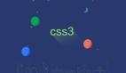
我们先分析怎么做的,这个效果分成两个部分:

  • 上层:真正动画的层级
  • 下层:充当一个底色

然后他们通过绝对定位叠在一起。

图片图片

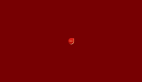
可以看到,动画没开始前,页面是这样的,可以理解这是一个底色下层,铺在下面,让每一个圆都有一个轮廓。

图片图片

动画上层开始的时候,下层是不变的,一直保持底色。

图片图片

开始写页面

页面

<!DOCTYPE html>
<html lang="en">

<head>
  <meta charset="UTF-8">
  <meta name="viewport" content="width=device-width, initial-scale=1.0">
  <title>Document</title>
  <style>
    body {
      background-color: #232b36;
    }

    .container {
      position: relative;
    }

    .grid {
      display: flex;
      flex-wrap: wrap;
      width: 240px;
    }

    .high {
      position: absolute;
      z-index: -1;
      top: 0;
      left: 0;
    }

    .low {
      opacity: .1;
      position: absolute;
      z-index: 0;
      top: 0;
      left: 0;
    }

    span {
      width: 4px;
      height: 4px;
      margin: 10px;
      border-radius: 50%;
      background-color: #fff;
      opacity: .6;
      display: block;
    }
  </style>
</head>

<body>
  <div class="container">
    <div class="grid high">
       30个span。。
    </div>
    <div class="grid low">
       30个span。。
    </div>
  </div>
</body>

</html>
  • 1.
  • 2.
  • 3.
  • 4.
  • 5.
  • 6.
  • 7.
  • 8.
  • 9.
  • 10.
  • 11.
  • 12.
  • 13.
  • 14.
  • 15.
  • 16.
  • 17.
  • 18.
  • 19.
  • 20.
  • 21.
  • 22.
  • 23.
  • 24.
  • 25.
  • 26.
  • 27.
  • 28.
  • 29.
  • 30.
  • 31.
  • 32.
  • 33.
  • 34.
  • 35.
  • 36.
  • 37.
  • 38.
  • 39.
  • 40.
  • 41.
  • 42.
  • 43.
  • 44.
  • 45.
  • 46.
  • 47.
  • 48.
  • 49.
  • 50.
  • 51.
  • 52.
  • 53.
  • 54.
  • 55.
  • 56.
  • 57.
  • 58.
  • 59.
  • 60.
  • 61.

现在能看到已经把两层叠在了一起。

图片图片

动画

接下来让 high 这一层开始动画

.high span {
      /* 动画名 */
      animation-name: myAnimation;
      /* 动画时长 */
      animation-duration: 1s;
      /* 无限循环 */
      animation-iteration-count: infinite;
      background-color: #AEF731;
    }
    @keyframes myAnimation {
      0% {
        transform: scale(0);
        opacity: 0;
      }

      100% {
        transform: scale(1);
        opacity: 1;
      }
    }
  • 1.
  • 2.
  • 3.
  • 4.
  • 5.
  • 6.
  • 7.
  • 8.
  • 9.
  • 10.
  • 11.
  • 12.
  • 13.
  • 14.
  • 15.
  • 16.
  • 17.
  • 18.
  • 19.
  • 20.

现在就有动画效果了

图片图片

但是我们可以看到刚刚我们想要的效果,他是中间先变,四周再变的

图片图片

所以我们需要使用到动画延迟,也就是

animation-delay这个样式属性

.delay-1 {
      animation-delay: 0.1s;
    }
    .delay-2 {
      animation-delay: 0.2s;
    }
    .delay-3 {
      animation-delay: 0.3s;
    }
    .delay-4 {
      animation-delay: 0.4s;
    }
  • 1.
  • 2.
  • 3.
  • 4.
  • 5.
  • 6.
  • 7.
  • 8.
  • 9.
  • 10.
  • 11.
  • 12.
<div class="grid high">
      <span class="delay-4"></span>
      <span class="delay-3"></span>
      <span class="delay-2"></span>
      <span class="delay-1"></span>
      <span></span>
      <span></span>
      <span class="delay-1"></span>
      <span class="delay-2"></span>
      <span class="delay-3"></span>
      <span class="delay-4"></span>
      <span class="delay-4"></span>
      <span class="delay-3"></span>
      <span class="delay-2"></span>
      <span class="delay-1"></span>
      <span></span>
      <span></span>
      <span class="delay-1"></span>
      <span class="delay-2"></span>
      <span class="delay-3"></span>
      <span class="delay-4"></span>
      <span class="delay-4"></span>
      <span class="delay-2"></span>
      <span class="delay-2"></span>
      <span class="delay-1"></span>
      <span></span>
      <span></span>
      <span class="delay-1"></span>
      <span class="delay-2"></span>
      <span class="delay-3"></span>
      <span class="delay-4"></span>
    </div>
  • 1.
  • 2.
  • 3.
  • 4.
  • 5.
  • 6.
  • 7.
  • 8.
  • 9.
  • 10.
  • 11.
  • 12.
  • 13.
  • 14.
  • 15.
  • 16.
  • 17.
  • 18.
  • 19.
  • 20.
  • 21.
  • 22.
  • 23.
  • 24.
  • 25.
  • 26.
  • 27.
  • 28.
  • 29.
  • 30.
  • 31.
  • 32.

这就达到了我们想要的效果啦~~~

图片图片

代码总览

图片图片

责任编辑:武晓燕 来源: 前端之神
相关推荐

2015-08-07 15:45:02

swift跑马灯源码

2011-07-29 10:01:21

IOS 跑马灯

2017-04-27 14:05:59

CSS动画前端

2022-08-29 17:39:53

应用开发css动画

2021-01-19 12:16:10

CSS前端UI

2013-01-14 17:18:43

Android开发TextView跑马灯效果

2017-05-03 11:30:20

CSS3小黄人动画

2022-07-12 08:32:17

transition跑马灯

2024-07-31 20:38:18

2024-03-13 08:21:53

冒泡排序动画

2022-03-28 08:44:15

css3水波动画

2021-02-09 07:26:38

前端css技术热点

2021-10-19 22:23:47

CSSBeautiful按钮

2024-08-29 08:13:58

2023-10-08 20:32:59

CSS定义Loading

2022-09-12 08:31:41

CSS3伪类URI

2022-09-15 10:30:06

CSS

2022-02-21 07:02:16

CSSbeautiful按钮

2020-11-04 13:55:06

CSS密室逃脱前端

2022-08-10 16:08:38

鸿蒙CSS
点赞
收藏

51CTO技术栈公众号