1、创建商品列表页面
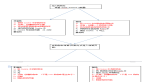
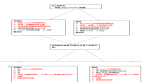
在这一节,我们将完成主页界面以及商品列表页签的设计,效果图如下:

从上面效果图可以看出,主界面商品列表页签主要由下面三个部分组成:
(1)顶部的Tabs组件。
(2)中间TabContent组件内包含List组件。其中List组件的item是一个水平布局,由一个垂直布局和一个Image组件组成;item中的垂直布局由3个Text组件组成。
(3)底部的页签导航。
下面来一起创建第一个页面,第一个页面的文件是pages/HomePage.ets,现在先创建该文件。
在与pages文件夹同级目录创建一个model文件夹,并在model目录下新建ArsData.ets、GoodsData.ets、Menu.ets和GoodsDataModels.ets文件,其中ArsData.ets、GoodsData.ets、Menu.ets是数据实体类,GoodsDataModels.ets是存放这三种实体数据集合,并定义了获取各种数据集合的方法。数据实体包含实体的属性和构造方法,可通过new ArsData(string,string) 来获取ArsData对象,ArsData.ets内容如下:
let NextId = 0;
export class ArsData {
  id: string;
  title: string;
  content: string;

  constructor(title: string, content: string) {
    this.id = `${NextId++}`;
    this.title = title;
    this.content = content;
  }
}- 1.
- 2.
- 3.
- 4.
- 5.
- 6.
- 7.
- 8.
- 9.
- 10.
- 11.
- 12.
GoodsData.ets代码如下:
let NextId = 0;
export class GoodsData {
  id: string;
  title: string;
  content: string;
  price: number;
  imgSrc: Resource;
  constructor(title: string, content: string, price: number, imgSrc: Resource) {
    this.id = `${NextId++}`;
    this.title = title;
    this.content = content;
    this.price = price;
    this.imgSrc = imgSrc;
  }
}- 1.
- 2.
- 3.
- 4.
- 5.
- 6.
- 7.
- 8.
- 9.
- 10.
- 11.
- 12.
- 13.
- 14.
- 15.
一个文件中可以包含多个class ,Menu.ets中就包含了Menu类和ImageItem类,Menu.ets代码如下:
let NextId = 0;
export class Menu {
  id: string;
  title: string;
  num: number;
  constructor(title: string, num: number) {
    this.id = `${NextId++}`;
    this.title = title;
    this.num = num;
  }
}
export class ImageItem {
  id: string;
  title: string;
  imageSrc: Resource;
  constructor(title: string, imageSrc: Resource) {
    this.id = `${NextId++}`;
    this.title = title;
    this.imageSrc = imageSrc;
  }
}
GoodsDataModels.ets代码如下:
import {GoodsData} from './GoodsData'
import {Menu, ImageItem} from './Menu'
import {ArsData} from './ArsData'
// 获取商品列表数据
export function initializeOnStartup(): Array<GoodsData> {
  let GoodsDataArray: Array<GoodsData> = []
  GoodsComposition.forEach(item => {
    console.log(item.title);
    GoodsDataArray.push(new GoodsData(item.title, item.content, item.price, item.imgSrc));
  })
  return GoodsDataArray;
}
// 获取底部默认图片列表数据
export function getIconPath(): Array<string> {
  let IconPath: Array<string> = ['nav/icon-buy.png','nav/icon-shopping-cart.png','nav/icon-my.png']
  return IconPath;
}
// 获取选中后图片列表数据
export function getIconPathSelect(): Array<string> {
  let IconPathSelect: Array<string> = ['nav/icon-home.png','nav/icon-shopping-cart-select.png','nav/icon-my-select.png']
  return IconPathSelect;
}
// 获取商品详情页图片详情列表
export function getDetailImages(): Array<string> {
  let detailImages: Array<string> = ['computer/computer1.png','computer/computer2.png','computer/computer3.png','computer/computer4.png','computer/computer5.png','computer/computer6.png']
  return detailImages;
}
// 获取菜单数据列表
export function getMenu(): Array<Menu> {
  let MenuArray: Array<Menu> = []
  MyMenu.forEach(item => {
    MenuArray.push(new Menu(item.title,item.num));
  })
  return MenuArray;
}
// 获取MyTrans数据列表
export function getTrans(): Array<ImageItem> {
  let ImageItemArray: Array<ImageItem> = []
  MyTrans.forEach(item => {
    ImageItemArray.push(new ImageItem(item.title,item.imageSrc));
  })
  return ImageItemArray;
}
// 获取More数据列表
export function getMore(): Array<ImageItem> {
  let ImageItemArray: Array<ImageItem> = []
  MyMore.forEach(item => {
    ImageItemArray.push(new ImageItem(item.title,item.imageSrc));
  })
  return ImageItemArray;
}
// 获取参数列表
export function getArs(): Array<ArsData> {
  let ArsItemArray: Array<ArsData> = []
  ArsList.forEach(item => {
    ArsItemArray.push(new ArsData(item.title,item.content));
  })
  return ArsItemArray;
}- 1.
- 2.
- 3.
- 4.
- 5.
- 6.
- 7.
- 8.
- 9.
- 10.
- 11.
- 12.
- 13.
- 14.
- 15.
- 16.
- 17.
- 18.
- 19.
- 20.
- 21.
- 22.
- 23.
- 24.
- 25.
- 26.
- 27.
- 28.
- 29.
- 30.
- 31.
- 32.
- 33.
- 34.
- 35.
- 36.
- 37.
- 38.
- 39.
- 40.
- 41.
- 42.
- 43.
- 44.
- 45.
- 46.
- 47.
- 48.
- 49.
- 50.
- 51.
- 52.
- 53.
- 54.
- 55.
- 56.
- 57.
- 58.
- 59.
- 60.
- 61.
- 62.
- 63.
- 64.
- 65.
- 66.
- 67.
- 68.
- 69.
- 70.
- 71.
- 72.
- 73.
- 74.
- 75.
- 76.
- 77.
- 78.
- 79.
- 80.
- 81.
在HomePage.ets文件中创建商品列表页签相关的组件,其中GoodsHome效果图如下:

代码如下:
@Component
struct GoodsHome {
  private goodsItems: GoodsData[]
  build() {
    Column() {
      Tabs() {
        TabContent() {
          GoodsList({ goodsItems: this.goodsItems });
        }
        .tabBar("Top Sellers")
        .backgroundColor(Color.White)
        TabContent() {
          GoodsList({ goodsItems: this.goodsItems });
        }
        .tabBar("Recommended")
        .backgroundColor(Color.White)
        TabContent() {
          GoodsList({ goodsItems: this.goodsItems });
        }
        .tabBar("Lifestyle")
        .backgroundColor(Color.White)
        TabContent() {
          GoodsList({ goodsItems: this.goodsItems });
        }
        .tabBar("Deals")
        .backgroundColor(Color.White)
      }
      .barWidth(500)
      .barHeight(25)
      .scrollable(true)
      .barMode(BarMode.Scrollable)
      .backgroundColor('#007DFF')
      .height(630)

    }
    .alignItems(HorizontalAlign.Start)
    .width('100%')
  }
}- 1.
- 2.
- 3.
- 4.
- 5.
- 6.
- 7.
- 8.
- 9.
- 10.
- 11.
- 12.
- 13.
- 14.
- 15.
- 16.
- 17.
- 18.
- 19.
- 20.
- 21.
- 22.
- 23.
- 24.
- 25.
- 26.
- 27.
- 28.
- 29.
- 30.
- 31.
- 32.
- 33.
- 34.
- 35.
- 36.
- 37.
- 38.
- 39.
在GoodsHome中使用Tabs组件,在Tabs组件中设置4个TabContent,给每个TabContent设置tabBar属性,并设置TabContent容器中的内容GoodsList组件,GoodsList组件的代码如下:
@Component
struct GoodsList {
  private goodsItems: GoodsData[]
  build() {
    Column() {
      List() {
        ForEach(this.goodsItems, item => {
          ListItem() {
            GoodsListItem({ goodsItem: item })
          }
        }, item => item.id.toString())
      }
      .height('100%')
      .width('100%')
      .align(Alignment.Top)
      .margin({top: 5})
    }
  }
}- 1.
- 2.
- 3.
- 4.
- 5.
- 6.
- 7.
- 8.
- 9.
- 10.
- 11.
- 12.
- 13.
- 14.
- 15.
- 16.
- 17.
- 18.
- 19.
2、创建购物车页面
购物车主界面如下:

从上面效果图可以看出,主界面购物车页签主要由下面三部分组成:
(1)顶部的Text组件。
(2)中间的List组件,其中List组件的item是一个水平的布局内包含一个toggle组件,一个Image组件和一个垂直布局,其item中的垂直布局是由2个Text组件组成。
(3)底部一个水平布局包含两个Text组件。
import {GoodsData} from '../model/GoodsData'
import {initializeOnStartup} from '../model/GoodsDataModels'
import prompt from '@system.prompt';
@Entry
@Component
export struct ShoppingCart {
  @Provide totalPrice : number =0
  private goodsItems: GoodsData[] = initializeOnStartup()
  build() {
    Column() {
      Column() {
        Text('ShoppingCart')
          .fontColor(Color.Black)
          .fontSize(25)
          .margin({ left: 60,right:60 })
          .align(Alignment.Center)
      }
      .backgroundColor('#FF00BFFF')
      .width('100%')
      .height(30)
      ShopCartList({ goodsItems: this.goodsItems });
      ShopCartBottom()
    }
    .alignItems(HorizontalAlign.Start)
 }
}- 1.
- 2.
- 3.
- 4.
- 5.
- 6.
- 7.
- 8.
- 9.
- 10.
- 11.
- 12.
- 13.
- 14.
- 15.
- 16.
- 17.
- 18.
- 19.
- 20.
- 21.
- 22.
- 23.
- 24.
- 25.
- 26.
新建ShopCartList组件用于存放购物车商品列表,ShopCartList组件的代码如下:
@Component
struct ShopCartList {
  private goodsItems: GoodsData[]
  build() {
    Column() {
      List() {
        ForEach(this.goodsItems, item => {
          ListItem() {
            ShopCartListItem({ goodsItem: item })
          }
        }, item => item.id.toString())
      }
      .height('100%')
      .width('100%')
      .align(Alignment.Top)
      .margin({top: 5})
    }
    .height(570)
  }
}- 1.
- 2.
- 3.
- 4.
- 5.
- 6.
- 7.
- 8.
- 9.
- 10.
- 11.
- 12.
- 13.
- 14.
- 15.
- 16.
- 17.
- 18.
- 19.
- 20.
ShopCartListItem组件效果图如下:

代码如下:
@Component
struct ShopCartListItem {
  @Consume totalPrice: number
  private goodsItem: GoodsData
  build() {
      Row() {
          Toggle({type: ToggleType.Checkbox})
            .width(10)
            .height(10)
            .onChange((isOn:boolean) => {
              if(isOn){
                this.totalPrice +=parseInt(this.goodsItem.price+'',0)
              }else{
                this.totalPrice -= parseInt(this.goodsItem.price+'',0)
              }
             })
          Image(this.goodsItem.imgSrc)
            .objectFit(ImageFit.ScaleDown)
            .height(100)
            .width(100)
            .renderMode(ImageRenderMode.Original)
          Column() {
            Text(this.goodsItem.title)
              .fontSize(14)
            Text('¥' + this.goodsItem.price)
              .fontSize(14)
              .fontColor(Color.Red)
          }
        }
        .height(100)
        .width(180)
        .margin({left: 20})
        .alignItems(VerticalAlign.Center)
        .backgroundColor(Color.White)
  }
}- 1.
- 2.
- 3.
- 4.
- 5.
- 6.
- 7.
- 8.
- 9.
- 10.
- 11.
- 12.
- 13.
- 14.
- 15.
- 16.
- 17.
- 18.
- 19.
- 20.
- 21.
- 22.
- 23.
- 24.
- 25.
- 26.
- 27.
- 28.
- 29.
- 30.
- 31.
- 32.
- 33.
- 34.
- 35.
- 36.
新建ShopCartBottom组件,ShopCartBottom组件效果图如下:

@Component
struct ShopCartBottom {
  @Consume totalPrice: number
  build() {
    Row() {
      Text('Total:  ¥'+this.totalPrice)
         .fontColor(Color.Red)
         .fontSize(18)

          .margin({left:20})
          .width(150)
      Text('Check Out')
        .fontColor(Color.Black)
        .fontSize(18)
        .margin({right:20,left:100})
        .onClick(()=>{
        prompt.showToast({
          message: 'Checking Out',
          duration: 10,
          bottom:100
        })
        })
    }
    .height(30)
    .width('100%')
    .backgroundColor('#FF7FFFD4')
    .alignItems(VerticalAlign.Bottom)
  }
}- 1.
- 2.
- 3.
- 4.
- 5.
- 6.
- 7.
- 8.
- 9.
- 10.
- 11.
- 12.
- 13.
- 14.
- 15.
- 16.
- 17.
- 18.
- 19.
- 20.
- 21.
- 22.
- 23.
- 24.
- 25.
- 26.
- 27.
- 28.
- 29.
3、构建商品详情页
商品详情页的效果如下图所示:

从上面效果图可以看出,商品详情页面主要由下面五部分组成:
(1)顶部的返回栏。
(2)Swiper组件。
(3)中间多个Text组件组成的布局。
(4)参数列表。
(5)底部的Buy。
在本节中,把上面每一部分都封装成一个组件,然后再放到入口组件内,当点击顶部返回图标时返回到主页面的商品列表页签,点击底部Buy时,会触发进度条弹窗。
1.在pages目录下面新建一个eTS Page, 命名为ShoppingDetail.ets,config.json文件pages属性中也会自动添加"pages/ShoppingDetail"页面路由。
2. 在ShoppingDetail.ets文件中创建入口组件,组件内容如下:
@Entry
@Component
struct ShoppingDetail {
  private arsItems: ArsData[] =  getArs()
  private detailImages: string[] = getDetailImages()
  build() {
      Column() {
        DetailTop()
          Scroll() {
            Column() {
              SwiperTop()
              DetailText()
              DetailArsList({ arsItems: this.arsItems })
              Image($rawfile('computer/computer1.png'))
                .height(220)
                .width('100%')
                .margin({top:30})
              Image($rawfile('computer/computer2.png'))
                .height(220)
                .width('100%')
                .margin({top:30})
              Image($rawfile('computer/computer3.png'))
                .height(220)
                .width('100%')
                .margin({top:30})
              Image($rawfile('computer/computer4.png'))
                .height(220)
                .width('100%')
                .margin({top:30})
              Image($rawfile('computer/computer5.png'))
                .height(220)
                .width('100%')
                .margin({top:30})
              Image($rawfile('computer/computer6.png'))
                .height(220)
                .width('100%')
                .margin({top:30})
            }
            .width('100%')
            .flexGrow(1)
          }
          .scrollable(ScrollDirection.Vertical)
          DetailBottom()
        }
        .height(630)
  }
}- 1.
- 2.
- 3.
- 4.
- 5.
- 6.
- 7.
- 8.
- 9.
- 10.
- 11.
- 12.
- 13.
- 14.
- 15.
- 16.
- 17.
- 18.
- 19.
- 20.
- 21.
- 22.
- 23.
- 24.
- 25.
- 26.
- 27.
- 28.
- 29.
- 30.
- 31.
- 32.
- 33.
- 34.
- 35.
- 36.
- 37.
- 38.
- 39.
- 40.
- 41.
- 42.
- 43.
- 44.
- 45.
- 46.
- 47.
其中顶部DetailTop组件效果图如下:

代码如下:
@Component
struct DetailTop{
  build(){
    Column(){
      Row(){
        Image($rawfile('detail/icon-return.png'))
          .height(20)
          .width(20)
          .margin({ left: 20, right: 250 })
          .onClick(() => {
              router.push({
                uri: "pages/HomePage"
              })
        })
      }
      .width('100%')
      .height(25)
      .backgroundColor('#FF87CEEB')
    }
    .width('100%')
    .height(30)
  }
}- 1.
- 2.
- 3.
- 4.
- 5.
- 6.
- 7.
- 8.
- 9.
- 10.
- 11.
- 12.
- 13.
- 14.
- 15.
- 16.
- 17.
- 18.
- 19.
- 20.
- 21.
- 22.
- 23.
SwiperTop组件效果图如下:

代码如下:
@Component
struct SwiperTop{
  build() {
      Column() {
        Swiper() {
          Image($rawfile('computer/computer1.png'))
            .height(220)
            .width('100%')
          Image($rawfile('computer/computer2.png'))
            .height(220)
            .width('100%')
          Image($rawfile('computer/computer3.png'))
            .height(220)
            .width('100%')
          Image($rawfile('computer/computer4.png'))
            .height(220)
            .width('100%')
          Image($rawfile('computer/computer5.png'))
            .height(220)
            .width('100%')
          Image($rawfile('computer/computer6.png'))
            .height(220)
            .width('100%')
        }
        .index(0)
        .autoPlay(true)
        .interval(3000)
        .indicator(true)
        .loop(true)
        .height(250)
        .width('100%')
      }
      .height(250)
      .width('100%')
  }
}- 1.
- 2.
- 3.
- 4.
- 5.
- 6.
- 7.
- 8.
- 9.
- 10.
- 11.
- 12.
- 13.
- 14.
- 15.
- 16.
- 17.
- 18.
- 19.
- 20.
- 21.
- 22.
- 23.
- 24.
- 25.
- 26.
- 27.
- 28.
- 29.
- 30.
- 31.
- 32.
- 33.
- 34.
- 35.
- 36.
DetailText组件效果图如下:

代码如下:
@Component
struct DetailText{
  build() {
    Column() {
      Row(){
        Image($rawfile('computer/icon-promotion.png'))
        .height(30)
        .width(30)
        .margin({left:10})
        Text('Special Offer: ¥9999')
        .fontColor(Color.White)
        .fontSize(20)
        .margin({left:10})
      }
      .width('100%')
      .height(35)
      .backgroundColor(Color.Red)
      Column(){
        Text('New Arrival: HUAWEI MateBook X Pro 2021')
        .fontSize(15)
        .margin({left:10})
        .alignSelf(ItemAlign.Start)
        Text('13.9-Inch, 11th Gen Intel® Core™ i7, 16 GB of Memory, 512 GB of Storage, Ultra-slim Business Laptop, 3K FullView Display, Multi-screen Collaboration, Emerald Green')
        .fontSize(10)
        .margin({left:10})
        Row(){
          Image($rawfile('nav/icon-buy.png'))
            .height(15)
            .width(15)
            .margin({left:10})
          Text('Limited offer')
            .fontSize(10)
            .fontColor(Color.Red)
            .margin({left:100})
        }
        .backgroundColor(Color.Pink)
        .width('100%')
        .height(25)
        .margin({top:10})
        Text(' Shipment:         2-day shipping')
          .fontSize(13)
          .fontColor(Color.Red)
          .margin({left:10,top:5})
          .alignSelf(ItemAlign.Start)
        Text('    Ship To:         Hubei,Wuhan,China')
          .fontSize(13)
          .fontColor(Color.Red)
          .margin({left:10,top:5})
          .alignSelf(ItemAlign.Start)
          .onClick(()=>{
            prompt.showDialog({title:'Location Select',})
          TextPicker()
          })
        Text('Guarantee:         Genuine guaranteed')
          .fontSize(13)
          .margin({left:10,top:5})
          .alignSelf(ItemAlign.Start)
      }
      .height(150)
      .width('100%')
    }
    .height(160)
    .width('100%')
  }
}- 1.
- 2.
- 3.
- 4.
- 5.
- 6.
- 7.
- 8.
- 9.
- 10.
- 11.
- 12.
- 13.
- 14.
- 15.
- 16.
- 17.
- 18.
- 19.
- 20.
- 21.
- 22.
- 23.
- 24.
- 25.
- 26.
- 27.
- 28.
- 29.
- 30.
- 31.
- 32.
- 33.
- 34.
- 35.
- 36.
- 37.
- 38.
- 39.
- 40.
- 41.
- 42.
- 43.
- 44.
- 45.
- 46.
- 47.
- 48.
- 49.
- 50.
- 51.
- 52.
- 53.
- 54.
- 55.
- 56.
- 57.
- 58.
- 59.
- 60.
- 61.
- 62.
- 63.
- 64.
- 65.
DetailArsList组件效果图如下:

代码如下:
@Component
struct DetailArsList{
  private arsItems: ArsData[]
  build() {
    Scroll() {
      Column() {
        List() {
          ForEach(this.arsItems, item => {
            ListItem() {
              ArsListItem({ arsItem: item })
            }
          }, item => item.id.toString())
        }
        .height('100%')
        .width('100%')
        .margin({ top: 5 })
        .listDirection(Axis.Vertical)
      }
      .height(200)
    }
  }
}- 1.
- 2.
- 3.
- 4.
- 5.
- 6.
- 7.
- 8.
- 9.
- 10.
- 11.
- 12.
- 13.
- 14.
- 15.
- 16.
- 17.
- 18.
- 19.
- 20.
- 21.
- 22.
ArsListItem组件代码如下:
@Component
struct ArsListItem {
  private arsItem: ArsData
  build() {
    Row() {
      Text(this.arsItem.title+" :")
        .fontSize(11)
        .margin({left:20})
      Blank(20)
      Text( this.arsItem.content)
        .fontSize(11)
        .margin({left:40,right:20})
    }
    .height(14)
    .width('100%')
    .backgroundColor(Color.White)
  }
}- 1.
- 2.
- 3.
- 4.
- 5.
- 6.
- 7.
- 8.
- 9.
- 10.
- 11.
- 12.
- 13.
- 14.
- 15.
- 16.
- 17.
- 18.
DetailBottom组件效果图如下:

代码如下:
@Component
struct DetailBottom{
  @Provide
  private value : number=1
  dialogController : CustomDialogController = new CustomDialogController({
    builder: DialogExample({action: this.onAccept}),
    cancel: this.existApp,
    autoCancel: true
  });
  onAccept() {
  }
  existApp() {
  }
  build(){
    Column(){
      Text('Buy')
      .width(40)
      .height(25)
      .fontSize(20)
      .fontColor(Color.White)
      .onClick(()=>{
        this.value=1
        this.dialogController.open()
      })
    }
    .alignItems(HorizontalAlign.Center)
    .backgroundColor(Color.Red)
    .width('100%')
    .height(40)
  }
}- 1.
- 2.
- 3.
- 4.
- 5.
- 6.
- 7.
- 8.
- 9.
- 10.
- 11.
- 12.
- 13.
- 14.
- 15.
- 16.
- 17.
- 18.
- 19.
- 20.
- 21.
- 22.
- 23.
- 24.
- 25.
- 26.
- 27.
- 28.
- 29.
- 30.
- 31.
DialogExample自定义弹窗组件效果图如下:

代码如下:
@CustomDialog
@Component
struct DialogExample {
  @Consume
  private value : number
  controller: CustomDialogController;
  action: () => void;
  build() {
    Column() {
      Progress({value: this.value++ >=100?100:this.value, total: 100, style: ProgressStyle.Capsule})
        .height(50)
        .width(100)
        .margin({top:5})
    }
    .height(60)
    .width(100)
  }
}- 1.
- 2.
- 3.
- 4.
- 5.
- 6.
- 7.
- 8.
- 9.
- 10.
- 11.
- 12.
- 13.
- 14.
- 15.
- 16.
- 17.
- 18.