前言
根据鸿蒙官网组件,结合相关技术,尝试列表组件的封装,提高开发的效率。
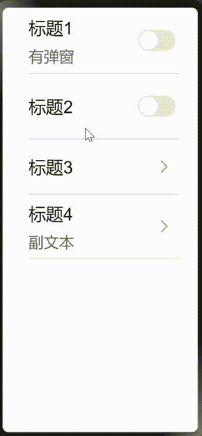
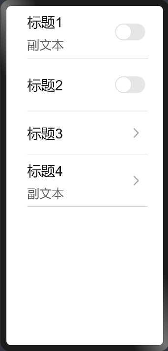
效果展示
实现步骤
封装组件代码:
hml代码:
<!--start判断是不是switch开关列表,不是就加点击阴影事件-->
    <div class="container {{ start ? 'background' : '' }}">
        <!--下划线-->
        <div class="underline" >
            <!--标题-->
            <div class="list-left">
                <div>
                    <text class="title">{{ title }}</text>
                </div>
                <!--describe判断是switch按钮还是图标-->
                <div class="list-des"
                     if="{{ subheading }}">
                    <text class="list">
                        <span>{{ subheading }}</span>
                    </text>
                </div>
            </div>
            <!--switch开关-->
            <div class="list-right">
                <switch class="switch-list"
                        if="{{ whether }}"
                        @change="switchHandle">
                </switch>
                <!--图标-->
                <image else @click="launch()" class="list-icon" src="../images/right.png">
                </image>
            </div>
        </div>
    </div>
css代码:
.container {
    justify-content: center;
    align-items: center;
    padding-left: 48px;
    padding-right: 35px;
    overscroll-effect: spring;
}
.background:active {
    background-color: #f6f6f6;
}
.underline {
    border-bottom: 1px solid #ccc;
}
/*标题样式代码*/
.list-left {
    flex: 1;
    flex-direction: column;
    justify-content: center;
}

.title {
    font-family: FZLTHJW--GB1-0;
    font-size: 32px;
    color: rgba(0, 0, 0, 0.9);
    letter-spacing: 0;
    font-weight: 400;
    height: 70px;
}
.list-des {
    width: 530px;
    flex-wrap: wrap;
    margin-bottom: 10px;
}
.list {
    font-family: HarmonyOS_Sans;
    font-size: 28px;
    color: rgba(0, 0, 0, 0.6);
    letter-spacing: 0;
    line-height: 35px;
    font-weight: 400;
    padding-bottom: 2px;
}
/*switch开关样式代码*/
.list-right {
    justify-content: flex-end;
    width: 115px;
    min-height: 100px;
    align-items: center;
}
.switch-list {
    width: 115px;
    height: 120px;
}
.list-icon {
    width: 14px;
    height: 26px;
    right: 20px;
}
js代码:
export default {
    props: {
        //数据绑定
        title: {
            default: ''
        },
        //数据绑定
        subheading: {
            default: ''
        },
        //true是switch开关,false是图标
        whether: {
            default: true,
            type:Boolean
        },
        //判断是不是switch开关列表,不是就加点击阴影事件
        start: {
            default: true,
            type:Boolean
        },

    },
    computed: {
        //判断是不是switch开关列表,不是就加点击阴影事件
        start() {
            return  !this.whether
        },
    },
    /**
     * 切换开关
     */
    switchHandle({checked: checkedValue}) {
        this.$emit('switchHandle', checkedValue);
        this.checkStatus = checkedValue;
    },
};
引入组件代码,实现列表功能:
hml代码:
  <element name="list-page" src="../../common/listitem/listitem.hml"></element>
<div class="container">
      <list-page whether="{{ true }}"
          @switch-handle="showDialog"
          title="标题1"
          subheading="副文本">
    </list-page>
    <list-page whether="{{ true }}"
          title="标题2">
    </list-page>
    <list-page whether="{{ false }}"
          title="标题3">
    </list-page>
    <list-page whether="{{ false }}"
          title="标题4"
          subheading="副文本">
    </list-page>
</div>
css代码:
.container {
    flex-direction: column;
    color: #fff;
    background-color: #fff;
    overscroll-effect: spring;
}
效果图为:
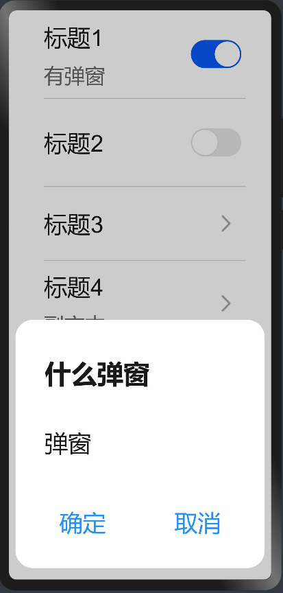
在标题1加弹窗:
hml代码:
<!--标题1的弹窗-->
    <dialog id="dataRoamDialog" class="dialog-main">
        <div class="dialog-div roaming">
            <text class="text ">什么弹窗</text>
            <div class="inner-txt">
                <text class="txt distance">弹窗</text>
            </div>
            <!--确定取消开关-->
            <div class="inner-btn">
                <button type="capsule"
                        value="确定"
                        onclick="setList"
                        class="btn-txt">
                </button>
                <div class="btn-l"></div>
                <button type="capsule"
                        value="取消"
                        onclick="setList"
                        class="btn-txt">
                </button>
            </div>
        </div>
    </dialog>
css代码:
/*弹窗样式*/
.dialog-main {
    width: 95%;
}
.dialog-div {
    flex-direction: column;
    align-items: flex-start;
}
.roaming {
    height: 340px;
}
.text {
    font-family: HarmonyOS_Sans_Medium;
    font-size: 36px;
    color: rgba(0, 0, 0, 0.9);
    letter-spacing: 0;
    line-height: 38px;
    font-weight: bold;
    height: 112px;
    padding: 40px 0 0 40px;
}
.inner-txt {
    width: 90%;
}
.txt {
    font-family: HarmonyOS_Sans;
    font-size: 32px;
    color: rgba(0, 0, 0, 0.9);
    letter-spacing: 0;
    line-height: 38px;
    font-weight: 400;
    flex: 1;
    height: 75px;
    justify-content: space-between;
    font-family: PingFangSC-Regular;
}
.distance {
    padding-left: 40px;
    margin-top: 20px;

.inner-btn {
    width: 100%;
    height: 120px;
    line-height: 80px;
    justify-content: center;
    align-items: center;
    margin: 10px 20px 0 20px;
}
.btn-txt {
    width: 230px;
    height: 80px;
    font-size: 32px;
    text-color: #1e90ff;
    background-color: #fff;
    text-align: left;
    align-items: center;
    flex: 1;
    text-align: center;
}
.btn-l {
    width: 2px;
    height: 50px;
    background-color: #ccc;
    margin: 0 10px;
}
js代码:
export default {
    /**
     * 标题1弹窗开启
     */
    showDialog() {
            this.$element('dataRoamDialog').show();
    },
    /**
     * 标题1弹窗取消
     */
    setList() {
        this.$element('dataRoamDialog').close();
    },
}
效果图:
总结
以上是所有的代码,写这个不难。主要用到了数据绑定跟三元运算和弹窗组件。相当于学习了鸿蒙的开发,自己尝试封装,让自己更加了解鸿蒙开发。本次分享希望对大家的学习有所帮助。