本文转载自微信公众号「Python学会」,作者Huangwei AI。转载本文请联系Python学会公众号。
1前言
我们需要处理、分析和探索的大量数据;随着技术的进步,这个数字只会越来越大。现在,想象一下必须盯着电子表格中的数千行数据,试图找到隐藏的模式并追踪数字的变化。这就是数据可视化的切入点。拥有可视化的信息摘要比浏览电子表格更容易识别模式和趋势。由于数据分析的目的是获得见解和发现模式,将数据可视化将使其更有价值,更容易探索。不同类型的图表和图表使交流数据发现更快和更有效。
可视化数据的重要性不仅仅是简化数据的解释。可视化数据有很多好处,比如:
- 显示数据随时间的变化。
- 确定相关事件发生的频率。
- 指出不同事件之间的相关性。
- 分析不同机会的价值和风险。
在本文中,我们将介绍一个Python库,它可以帮助我们创建引人注目的、令人惊叹的、交互式的可视化。它就是Pygal
2Pygal介绍
当使用Python可视化数据时,大多数数据科学家使用臭名昭著的Matplotlib、Seaborn或Bokeh。然而,一个经常被忽视的库是Pygal。Pygal允许用户创建漂亮的交互式图,这些图可以以最佳的分辨率转换成svg,以便使用Flask或Django打印或显示在网页上。
熟悉Pygal
Pygal提供了各种各样的图表,我们可以使用它们来可视化数据,确切地说,Pygal中有14种图表类别,比如柱状图、柱状图、饼状图、树形图、测量图等等。
要使用Pygal,我们得先安装它。
- $ pip install pygal
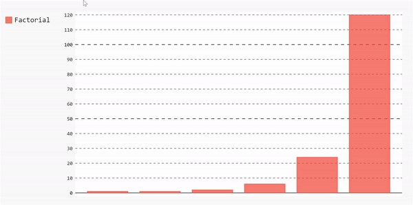
我们来画第一张图。我们将从最简单的字符开始,一个条形图。要使用Pygal绘制条形图,我们需要创建一个图表对象,然后向其添加一些值。
- bar_chart = pygal.Bar()
我们将绘制0到5的阶乘。在这里,我定义了一个简单的函数来计算一个数字的阶乘,然后使用它生成一个数字从0到5的阶乘列表。
- def factorial(n):
- if n == 1 or n == 0:
- return 1
- else:
- return n * factorial(n-1)
- fact_list = [factorial(i) for i in range(11)]
现在,我们可以使用它来创建我们的绘图
- bar_chart = pygal.Bar(height=400)
- bar_chart.add('Factorial', fact_list)
- display(HTML(base_html.format(rendered_chart=bar_chart.render(is_unicode=True))))
这将生成一个漂亮的交互图
如果我们想要绘制不同类型的图表,我们将遵循相同的步骤。您可能已经注意到,用于将数据链接到图表的主要方法是add方法。
现在,让我们开始基于实际数据构建一些东西。
应用
接下来,我将使用美国COVID-19病例数据集来解释Pygal的不同方面。
首先,为了确保一切顺利进行,我们需要确保两件事:
- Pandas和Pygal都装上了。
- 在jupiter Notebook中,我们需要启用IPython显示和HTML选项。
- from IPython.display import display, HTML
- base_html = """
- <!DOCTYPE html>
- <html>
- <head>
- <script type="text/javascript" src="http://kozea.github.com/pygal.js/javascripts/svg.jquery.js"></script>
- <script type="text/javascript" src="https://kozea.github.io/pygal.js/2.0.x/pygal-tooltips.min.js""></script>
- </head>
- <body>
- <figure>
- {rendered_chart}
- </figure>
- </body>
- </html>
- """
现在我们已经设置好了,我们可以开始使用Pandas来探索我们的数据,然后使用不同类型的图表来操作和准备它。
- import pygal
- import pandas as pd
- data = pd.read_csv("https://raw.githubusercontent.com/nytimes/covid-19-data/master/us-counties.csv")
该数据集包含基于日期、县和州的COVID-19病例和死亡信息。我们可以通过data.column看出这一点。列,以了解数据的形状。执行该命令将返回:
- Index(['date', 'county', 'state', 'fips', 'cases', 'deaths'], dtype='object')
我们可以获得一个10行的样本来查看我们的数据帧是什么样子的。
- data.sample(10)

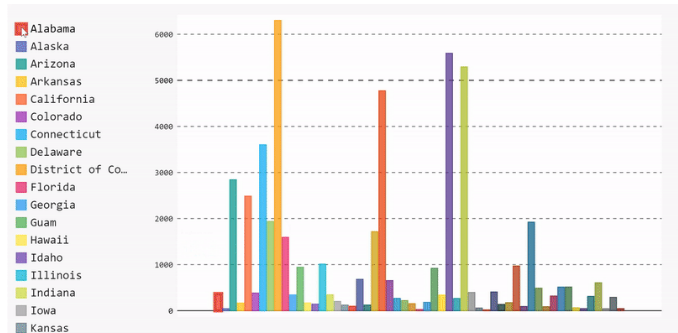
条形图
让我们首先绘制一个柱状图,显示每个状态的案例数的平均值。为此,我们需要执行以下步骤:
将数据按状态分组,提取每个状态的案例号,然后计算每个状态的平均值。
- mean_per_state = data.groupby('state')['cases'].mean()
开始构建数据并将其添加到条形图中。
- barChart = pygal.Bar(height=400)
- [barChart.add(x[0], x[1]) for x in mean_per_state.items()]
- display(HTML(base_html.format(rendered_chart=barChart.render(is_unicode=True))))
瞧,我们有一个条形图。我们可以通过从图例列表中取消选择来删除数据,也可以通过重新选择来重新添加数据。
柱状图的完整代码
- #Import needed libraries
- import pygal
- import pandas as pd
- #Parse the dataframe
- data = pd.read_csv("https://raw.githubusercontent.com/nytimes/covid-19-data/master/us-counties.csv")
- #Get the mean number of cases per states
- mean_per_state = data.groupby('state')['cases'].mean()
- #Draw the bar chart
- barChart = pygal.Bar(height=400)
- [barChart.add(x[0], x[1]) for x in mean_per_state.items()]
- display(HTML(base_html.format(rendered_chart=barChart.render(is_unicode=True))))
Treemap
条形图有助于显示整体数据,但如果我们想要更具体,我们可以选择不同类型的char,即treemap。树图对于显示数据中的类别非常有用。例如,在我们的数据集中,我们有基于每个州每个县的病例数量。柱状图显示了每个州的均值,但我们看不到每个州每个县的病例分布。一种方法是使用树图。
假设我们想要查看案例数量最多的10个州的详细案例分布情况。然后,在绘制数据之前,我们需要先对数据进行操作。
我们需要根据案例对数据进行排序,然后按州进行分组。
- sort_by_cases = data.sort_values(by=['cases'],ascending=False).groupby(['state'])['cases'].apply(list)
使用排序列表来获得案例数量最多的前10个州。
- top_10_states = sort_by_cases[:10]
使用这个子列表来创建我们的树图。
- treemap = pygal.Treemap(height=400)
- [treemap.add(x[0], x[1][:10]) for x in top_10_states.items()]
- display(HTML(base_html.format(rendered_chart=treemap.render(is_unicode=True))))
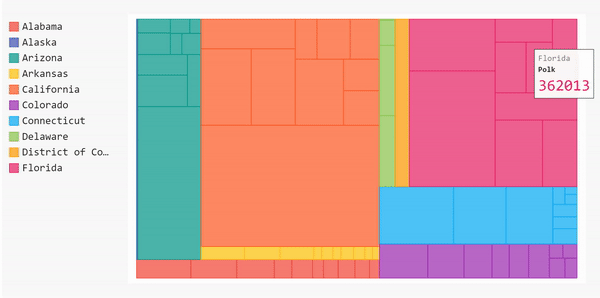
然而,这个树图没有被标记,所以当我们悬停在方块上时,我们无法看到县名。我们将在该州的所有县街区上看到该州的名称。为了避免这种情况并将县名添加到我们的treemap中,我们需要标记向图表提供的数据。

- #Import needed libraries
- import pygal
- import pandas as pd
- #Parse the dataframe
- data = pd.read_csv("https://raw.githubusercontent.com/nytimes/covid-19-data/master/us-counties.csv")
- #Sort states by cases count
- sort_by_cases = data.sort_values(by=['cases'],ascending=False).groupby(['state'])['cases'].apply(list)
- #Get the top 10 states with the highest number of cases
- top_10_states = sort_by_cases[:10]
- #Draw the treemap
- treemap = pygal.Treemap(height=400)
- [treemap.add(x[0], x[1][:10]) for x in top_10_states.items()]
- display(HTML(base_html.format(rendered_chart=treemap.render(is_unicode=True))))
在此之前,我们的数据每天都会更新。因此,每个县将进行几次重复。因为我们关心每个县的病例总数,所以在将数据添加到树图之前,我们需要清理数据。
- #Get the cases by county for all states
- cases_by_county = data.sort_values(by=['cases'],ascending=False).groupby(['state'], axis=0).apply(
- lambda x : [{"value" : l, "label" : c } for l, c in zip(x['cases'], x['county'])])
- cases_by_county= cases_by_county[:10]
- #Create a new dictionary that contains the cleaned up version of the data
- clean_dict = {}
- start_dict= cases_by_county.to_dict()
- for key in start_dict.keys():
- values = []
- labels = []
- county = []
- for item in start_dict[key]:
- if item['label'] not in labels:
- labels.append(item['label'])
- values.append(item['value'])
- else:
- i = labels.index(item['label'])
- values[i] += item['value']
- for l,v in zip(labels, values):
- county.append({'value':v, 'label':l})
- clean_dict[key] = county
- #Convert the data to Pandas series to add it to the treemap
- new_series = pd.Series(clean_dict)
然后,我们可以将该系列添加到treemap,并绘制它的标记版本。
- treemap = pygal.Treemap(height=200)
- [treemap.add(x[0], x[1][:10]) for x in new_series.iteritems()]
- display(HTML(base_html.format(rendered_chart=treemap.render(is_unicode=True))))
太棒了!现在我们的树形图被标记了。如果将鼠标悬停在这些块上,就可以看到县的名称、州和该县的病例数。
完整的代码
- #Import needed libraries
- import pygal
- import pandas as pd
- #Parse the dataframe
- data = pd.read_csv("https://raw.githubusercontent.com/nytimes/covid-19-data/master/us-counties.csv")
- #Get the cases by county for all states
- cases_by_county = data.sort_values(by=['cases'],ascending=False).groupby(['state'], axis=0).apply(
- lambda x : [{"value" : l, "label" : c } for l, c in zip(x['cases'], x['county'])])
- cases_by_county= cases_by_county[:10]
- #Create a new dictionary that contains the cleaned up version of the data
- clean_dict = {}
- start_dict= cases_by_county.to_dict()
- for key in start_dict.keys():
- values = []
- labels = []
- county = []
- for item in start_dict[key]:
- if item['label'] not in labels:
- labels.append(item['label'])
- values.append(item['value'])
- else:
- i = labels.index(item['label'])
- values[i] += item['value']
- for l,v in zip(labels, values):
- county.append({'value':v, 'label':l})
- clean_dict[key] = county
- #Convert the data to Pandas series to add it to the treemap
- new_series = pd.Series(clean_dict)
- #Draw the treemap
- treemap = pygal.Treemap(height=200)
- [treemap.add(x[0], x[1][:10]) for x in new_series.iteritems()]
- display(HTML(base_html.format(rendered_chart=treemap.render(is_unicode=True))))
饼状图
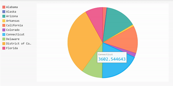
我们可以用另一种形式来展示这一信息,那就是用饼状图来展示案例数量最多的10个州。使用饼状图,我们可以看到一个州的案例数相对于其他州的百分比。
由于我们已经完成了所有的数据帧操作,我们可以使用它来立即创建饼图。
- first10 = list(sort_by_cases.items())[:10]
- [pi_chart.add(x[0], x[1]) for x in first10]
- display(HTML(base_html.format(rendered_chart=pi_chart.render(is_unicode=True))))
饼状图的完整代码
- #Import needed libraries
- import pygal
- import pandas as pd
- #Parse the dataframe
- data = pd.read_csv("https://raw.githubusercontent.com/nytimes/covid-19-data/master/us-counties.csv")
- #Get the mean number of cases per states
- sort_by_cases = data.sort_values(by=['cases'],ascending=False).groupby(['state'])['cases'].apply(list)
- #Draw the bar chart
- pi_chart = pygal.Pie(height=400)
- #Get the top 10 states
- first10 = list(sort_by_cases.items())[:10]
- [pi_chart.add(x[0], x[1]) for x in first10]
- display(HTML(base_html.format(rendered_chart=pi_chart.render(is_unicode=True))))