Toolbar的简介
Toolbar 是 android 5.0 引入的一个新控件,Toolbar出现之前,我们很多时候都是使用ActionBar以及ActionActivity实现顶部导航栏的,因此Toolbar可以理解为是ActionBar的升级版。Toolbar大大扩展了ActionBar,使用更灵活,不像ActionBar那么固定,Toolbar更像是一般的View元素,可以被放置在view树体系的任意位置,可以应用动画,可以跟着scrollView滚动,可以与布局中的其他view交互。
Toolbar的基本使用
1、要想使用Toolbar,首先应该在Gradle的配置脚本里面添加V7兼容包(代码如下,版本是楠妹妹写本文的时候的版本),或者通过Android Studio的图形化界面的操作方法把V7兼容包依赖进来。
- compile 'com.android.support:appcompat-v7:23.1.1'
2、在我们需要顶部导航栏的布局文件当中添加Toolbar,并且配置一些常用的属性(使用自定义属性的时候需要注意把命名空间“app”添加到根节点)。
- xmlns:app="http://schemas.android.com/apk/res-auto"
这里只列出一些常用的属性,比如最小高度,返回按钮的图标,背景等等。这里需要注意的是,属性值中的“?”表示对Android系统的主题样式进行重用。意思是如果我们改变了主题样式中的colorPrimary属性的话,Toolbar的背景颜色也会随之改变,因此提醒我们去主题样式中进行一些配置。
- <android.support.v7.widget.Toolbar
- android:id="@+id/toolbar"
- android:layout_width="match_parent"
- android:layout_height="wrap_content"
- android:background="?attr/colorPrimary"
- android:minHeight="?actionBarSize"
- app:navigationIcon="@mipmap/arrow_left"
- app:title="标题"/>
3、在styles.xml文件中进行一些常用的配置。由于我们使用的是
AppCompatActivity,因此必须使用AppCompat的相关主题,笔者这里使用亮色调的没有ActionBar的主题,注意需要在清单文件当中去使用自己定义的主题。为了完全去掉ActionBar,需要把windowActionBar、windowNoTitle以及加上android声明的也写上,确保把系统自带的以及第三方兼容包的ActionBar都彻底去掉。
- <style name="AppTheme" parent="Theme.AppCompat.Light.NoActionBar">
- <item name="colorPrimary">@color/red</item>
- <item name="colorPrimaryDark">@color/green</item>
- <item name="colorAccent">@color/blue</item>
- <item name="android:textColorPrimary">@color/white</item>
- <item name="android:windowActionBar">false</item>
- <item name="android:windowNoTitle">true</item>
- <item name="windowActionBar">false</item>
- <item name="windowNoTitle">true</item>
- </style>
4、下面对主题中的几个颜色进行讲解,请参考下面的图片进行理解。
- colorPrimaryDark是我们手机最顶端的状态栏的背景颜色(改变它需要Android5.0以及以上的手机支持才行)。
- colorPrimary是指导航栏的颜色。
- colorAccent是指我们常用控件比如Button等的颜色。
- textColorPrimary是指我们导航栏中标题的颜色。
- windowBackground是指我们窗体的默认颜色。
- navigationBarColor是指Android手机中虚拟按键的背景颜色。

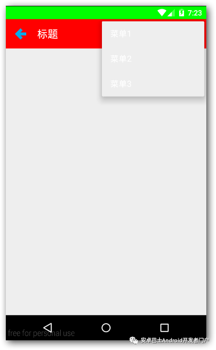
5、代码中对Toolbar进行常见的操作。可以通过ID找到Toolbar之后,可以对导航图标进行点击监听,前提必须是在布局文件或者java代码中添加了导航图标。同理也可以使用菜单,具体看注释,不再赘述。
- Toolbar toolbar = (Toolbar) findViewById(R.id.toolbar);
- //对Toolbar左边的导航图标进行监听
- toolbar.setNavigationOnClickListener(new View.OnClickListener() {
- @Override
- public void onClick(View v) {
- Toast.makeText(MainActivity.this, "返回", Toast.LENGTH_SHORT).show();
- }
- });
- //Toolbar中使用菜单toolbar.inflateMenu(R.menu.menu_main);
- toolbar.setOnMenuItemClickListener(new Toolbar.OnMenuItemClickListener() {
- @Override
- public boolean onMenuItemClick(MenuItem item) {
- switch (item.getItemId()) {
- case R.id.action_item1:
- Toast.makeText(MainActivity.this, "菜单1", Toast.LENGTH_SHORT).show();
- return true;
- case R.id.action_item2:
- Toast.makeText(MainActivity.this, "菜单2", Toast.LENGTH_SHORT).show();
- return true;
- case R.id.action_item3:
- Toast.makeText(MainActivity.this, "菜单3", Toast.LENGTH_SHORT).show();
- return true;
- } return false;
- }
- });
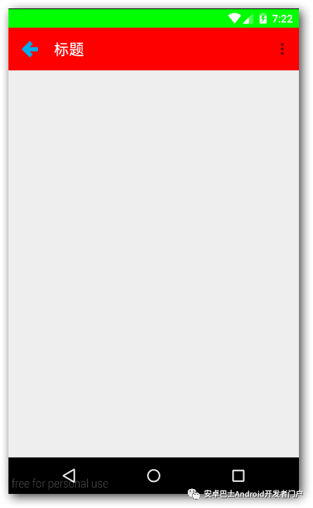
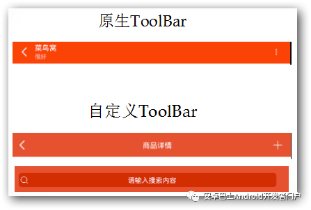
6、运行效果图
Toolbar高级使用篇--自定义Toolbar
通过下面的对比可以知道,原生的Toolbar画面太美不忍直视,一般来说要在项目当中使用Toolbar我们都应该去自定义Toolbar。下面开始讨论如何去自定义Toolbar。
下面先让我给出核心的要点:
- 自定义布局,添加到Toolbar当中
- 有必要的时候自定义一些属性
- 自定义Class继承Toolbar,读取自定义属性,对Toolbar的布局显示,内容进行设置,***需要对外公开一些函数用于设置标题、监听等。下面通过步骤来详细说明。
1、写一个自定义的布局,用来放入自定义Toolbar。
- <?xml version="1.0" encoding="utf-8"?>
- <RelativeLayout
- xmlns:android="http://schemas.android.com/apk/res/android"
- android:layout_width="match_parent"
- android:layout_height="wrap_content"
- >
- <RelativeLayout
- android:layout_width="match_parent"
- android:layout_height="wrap_content"
- android:layout_marginLeft="10dp"
- android:layout_marginRight="10dp">
- <ImageView
- android:id="@+id/toolbar_leftButton"
- android:layout_width="@dimen/icon_size"
- android:layout_height="@dimen/icon_size"
- android:layout_alignParentLeft="true"
- android:layout_centerVertical="true"
- android:src="@mipmap/icon_background"
- android:textColor="@color/white"
- android:visibility="visible"
- />
- <ImageView
- android:id="@+id/toolbar_rightButton"
- android:layout_width="@dimen/icon_size"
- android:layout_height="@dimen/icon_size"
- android:layout_alignParentRight="true"
- android:layout_centerVertical="true"
- android:src="@mipmap/icon_background"
- android:textColor="@color/white"
- android:visibility="visible"
- />
- <EditText
- android:id="@+id/toolbar_searchview"
- style="@style/search_view"
- android:layout_width="match_parent"
- android:layout_height="wrap_content"
- android:layout_centerVertical="true"
- android:layout_gravity="center"
- android:layout_marginLeft="10dp"
- android:layout_marginRight="10dp"
- android:layout_toLeftOf="@id/toolbar_rightButton"
- android:layout_toRightOf="@id/toolbar_leftButton"
- android:drawableLeft="@mipmap/icon_search"
- android:gravity="center"
- android:hint="请输入搜索内容"
- android:visibility="gone"
- />
- <TextView
- android:id="@+id/toolbar_title"
- android:layout_width="match_parent"
- android:layout_height="wrap_content"
- android:layout_centerInParent="true"
- android:layout_gravity="center"
- android:layout_marginLeft="10dp"
- android:layout_marginRight="10dp"
- android:layout_toLeftOf="@id/toolbar_rightButton"
- android:layout_toRightOf="@id/toolbar_leftButton"
- android:gravity="center"
- android:textColor="@color/white"
- android:textSize="20sp"
- android:visibility="gone"
- />
- </RelativeLayout>
- </RelativeLayout>
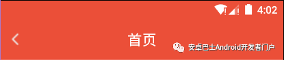
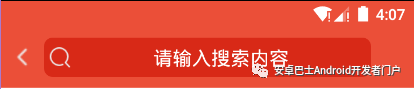
让我们通过下面两张效果图来进行说明吧O(∩_∩)O~~。
由于一般不推荐把宽高意外的属性写在最外面根节点,因此我在最外面的相对布局里面又内嵌了一个相对布局,并且设置了左右的边距(margin)。至于如何布局要根据实际项目而定。楠妹妹这里的需求是,标题和搜索框能够随时切换。因此标题和搜索框是通过项目布局重叠在一起的,需要用到其中一个的时候就把另外一个隐藏掉。另外需要注意的地方就是,左右按钮***也不要用Toolbar自带的,因为可能会造成布局不对称问题,使得标题(搜索框)不能居中。在按钮不使用的时候,我们并不是通过gone的方法隐藏掉的,而是通过@mipmap/icon_background空白图片来进行占位,保持布局对称。
2、在values文件夹新建attrs.mxl文件,用于存放自定义的一些属性。这些属性都可以通过字面意思读懂,不详细解释了。
- <?xml version="1.0" encoding="utf-8"?>
- <resources>
- <declare-styleable name="CNToolbar">
- <attr name="showSearchView" format="boolean"/>
- <attr name="leftButtonIcon" format="reference"/>
- <attr name="rightButtonIcon" format="reference"/>
- <attr name="myTitle" format="string"/>
- </declare-styleable>
- </resources>
3、自定义Class继承Toolbar。代码的主要工作是初始化界面还有监听器,对外公开操作的接口。
初始化界面的时候需要把自定义属性的值通过TintTypedArray读取进来,然后进行一些界面显示方面的设置。
初始化监听器,需要用到接口的回调。具体步骤是公开的声明接口,接口里面有onClick方法;声明该接口的实现,作为Toolbar的私有成员变量;公开setListener方法,把传进来的Listener实现类赋值给这个成员变量;在必须的时候调用成员变量的onClick方法(如在左边的按钮的点击事件中调用)。
公开一些函数,比如设置标题,设置是否显示搜索框、标题等等。
- /**
- * 自定义的导航栏
- */public class CNToolbar extends Toolbar {
- private TextView toolbar_title;
- private EditText toolbar_searchview;
- private ImageView toolbar_leftButton;
- private ImageView toolbar_rightButton;
- private View mChildView;
- private boolean showSearchView;
- private Drawable left_button_icon;
- private Drawable right_button_icon;
- private String title;
- public CNToolbar(Context context) {
- this(context, null, 0);
- } public CNToolbar(Context context, @Nullable AttributeSet attrs) {
- this(context, attrs, 0);
- } public CNToolbar(Context context, @Nullable AttributeSet attrs, int defStyleAttr) {
- super(context, attrs, defStyleAttr); //通过代码得到布局文件当中一些属性的值
- final TintTypedArray a = TintTypedArray.obtainStyledAttributes(getContext(), attrs,
- R.styleable.CNToolbar, defStyleAttr, 0);
- showSearchView = a.getBoolean(R.styleable.CNToolbar_showSearchView, false);
- left_button_icon = a.getDrawable(R.styleable.CNToolbar_leftButtonIcon);
- right_button_icon = a.getDrawable(R.styleable.CNToolbar_rightButtonIcon);
- title = a.getString(R.styleable.CNToolbar_myTitle);
- a.recycle(); //初始界面
- initView(); //初始监听器
- initListener();
- } /**
- * 初始化布局
- */
- private void initView() {
- if (mChildView == null) {
- mChildView = View.inflate(getContext(), R.layout.toolbar, null);
- toolbar_title = (TextView) mChildView.findViewById(R.id.toolbar_title);
- toolbar_searchview = (EditText) mChildView.findViewById(R.id.toolbar_searchview);
- toolbar_leftButton = (ImageView) mChildView.findViewById(R.id.toolbar_leftButton);
- toolbar_rightButton = (ImageView) mChildView.findViewById(R.id.toolbar_rightButton);
- //添加自定义的布局到Toolbar
- addView(mChildView); //设置标题、搜索框、左右按钮是否显示,并且设置按钮的图标
- if (showSearchView) {
- showSearchview();
- hideTitle();
- } else {
- hideSearchview();
- showTitle();
- if (title != null) {
- toolbar_title.setText(title);
- }
- } if (left_button_icon != null) {
- toolbar_leftButton.setImageDrawable(left_button_icon);
- } if (right_button_icon != null) {
- toolbar_rightButton.setImageDrawable(right_button_icon);
- }
- }
- } /**
- * 重写设置标题的方法
- *
- * @param title
- */
- @Override
- public void setTitle(CharSequence title) {
- toolbar_title.setText(title);
- } @Override
- public void setTitle(@StringRes int resId) {
- toolbar_title.setText(resId);
- } /**
- * 设置左右按钮的图标
- *
- * @param d
- */
- public void setLeftButtonIconDrawable(Drawable d) {
- toolbar_leftButton.setImageDrawable(d);
- } public void setRightButtonIconDrawable(Drawable d) {
- toolbar_rightButton.setImageDrawable(d);
- } /**
- * 标题与搜索框的切换
- */
- public void setShowSearchView() {
- hideTitle();
- showSearchview();
- } public void setShowTitleView(String title) {
- hideSearchview();
- showTitle();
- toolbar_title.setText(title);
- } /**
- * 左右按钮的监听
- */
- private void initListener() {
- toolbar_leftButton.setOnClickListener(new OnClickListener() {
- @Override
- public void onClick(View v) {
- if (onLeftButtonClickListener != null) {
- onLeftButtonClickListener.onClick();
- }
- }
- });
- toolbar_rightButton.setOnClickListener(new OnClickListener() {
- @Override
- public void onClick(View v) {
- if (onRightButtonClickListener != null) {
- onRightButtonClickListener.onClick();
- }
- }
- });
- } public interface OnLeftButtonClickListener {
- void onClick();
- } public interface OnRightButtonClickListener {
- void onClick();
- } private OnLeftButtonClickListener onLeftButtonClickListener;
- private OnRightButtonClickListener onRightButtonClickListener;
- public void setOnLeftButtonClickListener(OnLeftButtonClickListener listener) {
- onLeftButtonClickListener = listener;
- } public void setOnRightButtonClickListener(OnRightButtonClickListener listener) {
- onRightButtonClickListener = listener;
- } /**
- * 设置标题或者搜索框是否显示
- */
- private void showTitle() {
- toolbar_title.setVisibility(View.VISIBLE);
- } private void hideTitle() {
- toolbar_title.setVisibility(View.GONE);
- } private void showSearchview() {
- toolbar_searchview.setVisibility(View.VISIBLE);
- } private void hideSearchview() {
- toolbar_searchview.setVisibility(View.GONE);
- }
- }
- 4、使用,在必须的地方如同一般的控件去使用就可以了,注意加上自定义属性的命名空间,一般为auto就可以了。
- <?xml version="1.0" encoding="utf-8"?>
- <LinearLayout xmlns:android="http://schemas.android.com/apk/res/android"
- xmlns:app="http://schemas.android.com/apk/res-auto"
- android:layout_width="match_parent"
- android:layout_height="match_parent"
- android:orientation="vertical">
- <com.nan.cnshop.widget.CNToolbar
- android:id="@+id/toolbar"
- android:layout_width="match_parent"
- android:layout_height="wrap_content"
- android:background="?attr/colorPrimary"
- android:minHeight="?actionBarSize"
- app:leftButtonIcon="@mipmap/icon_back_32px"
- app:showSearchView="false"
- app:myTitle="首页"
- />
- <WebView
- android:id="@+id/webview"
- android:layout_width="match_parent"
- android:layout_height="match_parent"
- />
- </LinearLayout>
4、使用,在必须的地方如同一般的控件去使用就可以了,注意加上自定义属性的命名空间,一般为auto就可以了。
- <?xml version="1.0" encoding="utf-8"?>
- <LinearLayout xmlns:android="http://schemas.android.com/apk/res/android"
- xmlns:app="http://schemas.android.com/apk/res-auto"
- android:layout_width="match_parent"
- android:layout_height="match_parent"
- android:orientation="vertical">
- <com.nan.cnshop.widget.CNToolbar
- android:id="@+id/toolbar"
- android:layout_width="match_parent"
- android:layout_height="wrap_content"
- android:background="?attr/colorPrimary"
- android:minHeight="?actionBarSize"
- app:leftButtonIcon="@mipmap/icon_back_32px"
- app:showSearchView="false"
- app:myTitle="首页"
- />
- <WebView
- android:id="@+id/webview"
- android:layout_width="match_parent"
- android:layout_height="match_parent"
- />
- </LinearLayout>
代码当中也可以使用了,具体就不再赘述了。
- final CNToolbar toolbar = (CNToolbar) v.findViewById(R.id.toolbar);
- toolbar.setOnLeftButtonClickListener(new CNToolbar.OnLeftButtonClickListener() {
- @Override
- public void onClick() {
- toolbar.setShowSearchView();
- }
- });