Material Design中的动画将为用户提供操作反馈并在用户与您的应用进行互动时提供视觉连续性。 Material Design将为按钮与操作行为转换提供一些默认动画,而 Android 5.0(API Level 21)及更高版本可让您定制这些动画,同时也可创建新动画:
一、触摸反馈动画
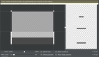
效果图:
Material Design的触摸反馈可在用户与 UI 元素互动时,在接触点上提供即时视觉确认。 适用于按钮的默认触摸动画使用全新 RippleDrawable类别,以波纹效果实现不同状态间的转换。
在大多数情况下,应以下列方式指定视图背景,在您的视图 XML 中应用此功能:
- android:attr/selectableItemBackground 指定有界的波纹。
- android:attr/selectableItemBackgroundBorderless 指定越过视图边界的波纹。 它将由一个非空背景的视图的最近父项所绘制和设定边界。
任何view处于可点击状态,都可以使用RippleDrawable来达到水波纹特效,而且必须处于可点击状态,才会出现波纹动画效果。
在代码中可以这样设置:
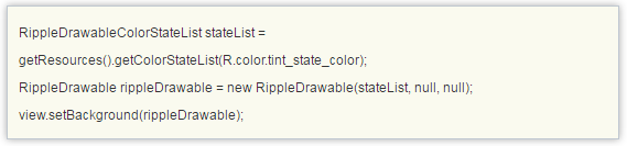
注意:selectableItemBackgroundBorderless是 API Level 21 中推出的新属性。
此外,您可利用 ripple元素将 RippleDrawable定义为一个 XML 资源。
您可以为 RippleDrawable对象指定一种颜色。如果要改变默认触摸反馈颜色,请使用主题的 android:colorControlHighlight属性。
如果要了解更多信息,请参阅 RippleDrawable类别的 API 参考文档。
我们来看看系统自带的触摸反馈动画是怎么实现的,为什么只需要在view的background或者foreground属性设置成?android:attr/selectableItemBackground或者?android:attr/selectableItemBackgroundBorderless就可以实现波纹动画的效果?这两个属性点进去,可以看到在路径sdk/platforms/android-xx/data/res/values/attrs.xml文件中有定义这么两个属性:
- <!-- Background drawable for bordered standalone items that need focus/pressed states. -->
- <attr name="selectableItemBackground" format="reference" />
- <!-- Background drawable for borderless standalone items that need focus/pressed states. -->
- <attr name="selectableItemBackgroundBorderless" format="reference" />
我们想到,这两个属性既然是整个app中有效的,那可能会是在Theme中的属性吧,那就去AndroidManifest文件中跟这个Theme一步步看下去,***在Base.V21.Theme.AppCompat.Light这个style中看到确实是有这两个item属性:
- <item name="selectableItemBackground">?android:attr/selectableItemBackground</item>
- <item name="selectableItemBackgroundBorderless">?android:attr/selectableItemBackgroundBorderless</item>
但是这里还是调用的系统的定义的属性,继续往下追,在android:Theme.Material和android:Theme.Material.Light中,可以看到:
- <item name="selectableItemBackground">@drawable/item_background_material</item>
- <item name="selectableItemBackgroundBorderless">@drawable/item_background_borderless_material</item>
然后sdk路径下platforms\\android-xx\\data\\res\\drawable可以找到这些资源文件如下图:
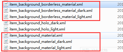
item_background_material的内容是:
- <ripple xmlns:android="http://schemas.android.com/apk/res/android"
- android:color="?attr/colorControlHighlight">
- <item android:id="@id/mask">
- <color android:color="@color/white" />
- </item>
- </ripple>
item_background_borderless_material的内容是:
- <ripple xmlns:android="http://schemas.android.com/apk/res/android"
- android:color="?attr/colorControlHighlight" />
系统的做法是用ripple元素将 RippleDrawable定义为一个 XML 资源,而通过看View的源码中在构造方法中是这样获取background属性的:
- public View(Context context, @Nullable AttributeSet attrs, int defStyleAttr, int defStyleRes) {
- this(context);
- final TypedArray a = context.obtainStyledAttributes(
- attrs, com.android.internal.R.styleable.View, defStyleAttr, defStyleRes);
- if (mDebugViewAttributes) {
- saveAttributeData(attrs, a);
- }
- Drawable background = null;
- switch (attr) {
- case com.android.internal.R.styleable.View_background:
- background = a.getDrawable(attr);
- break;
- .
- .
- .
- }
也就是说,这个background实际上就是RippleDrawable类。那我们就来看看这个RippleDrawable内部到底是怎么做的吧。
首先官方文档对RippleDrawable解释是
Drawable that shows a ripple effect in response to state changes. The anchoring position of the ripple for a given state may be specified by calling setHotspot(float, float)with the corresponding state attribute identifier.
通过显示出波纹效果来响应状态的改变,对于给定状态的波纹的锚定位置可以通过调用具有对应的状态属性标识符的setHotspot(float,float)来指定。
RippleDrawable继承自LayerDrawable,而LayerDrawable是继承Drawable,RippleDrawable又是为了响应View的statechange,那就看看Drawable类中对点击时的状态处理吧。
- public boolean setState(@NonNull final int[] stateSet) {
- if (!Arrays.equals(mStateSet, stateSet)) {
- mStateSet = stateSet;
- return onStateChange(stateSet);
- }
- return false;
- }
给Drawable设置状态属性时,会把状态的数组传给onStateChange方法,在RippleDrawable中重写了onStateChange。
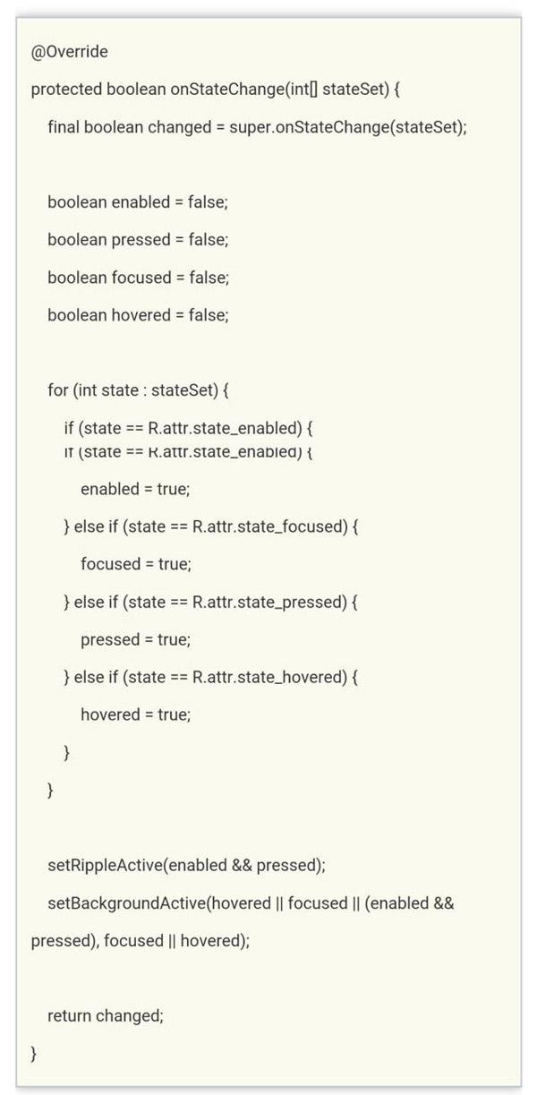
看到setRippleActive和setBackgroundActive这两个方法应该可以猜到是什么意思了,接着看。
- private void setRippleActive(boolean active) {
- if (mRippleActive != active) {
- mRippleActive = active;
- if (active) {
- tryRippleEnter();
- } else {
- tryRippleExit();
- }
- }
- }
如果Drawable是enable=true且pressd=true时,会调用tryRippleEnter方法

看到这里,我们可以知道要开始做波纹动画的效果了。mRipple 是RippleForeground类的实例,然而我没有在RippleForeground类中找到setup和enter方法,但是RippleForeground继承自RippleComponent类,于是,我在这个类中发现了这两个方法。
- public final void setup(float maxRadius, int densityDpi) {
- if (maxRadius >= 0) {
- mHasMaxRadius = true;
- mTargetRadius = maxRadius;
- } else {
- mTargetRadius = getTargetRadius(mBounds);
- }
- mDensityScale = densityDpi * DisplayMetrics.DENSITY_DEFAULT_SCALE;
- onTargetRadiusChanged(mTargetRadius);
- }
setup是初始化一系列参数,enter创建一个动画并开始动画。
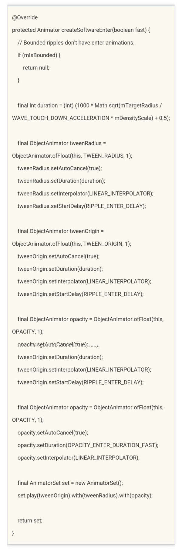
从上面创建动画的代码可以看到,实际上是一个组合的属性动画,然后自定义了三个属性波纹半径TWEEN_RADIUS、波纹中心点TWEEN_ORIGIN和波纹的不透明度OPACITY。通过这三个属性的过渡变化得到一个复合的动画。以上就是前景波纹动画效果的实现过程。
- private void setBackgroundActive(boolean active, boolean focused) {
- if (mBackgroundActive != active) {
- mBackgroundActive = active;
- if (active) {
- tryBackgroundEnter(focused);
- } else {
- tryBackgroundExit();
- }
- }
- }
mBackground是RippleBackground类的实例,与RippleForeground不同的是,背景动画只是改变了不透明度。
- @Override
- protected Animator createSoftwareEnter(boolean fast) {
- // Linear enter based on current opacity.
- final int maxDuration = fast ? OPACITY_ENTER_DURATION_FAST : OPACITY_ENTER_DURATION;
- final int duration = (int) ((1 - mOpacity) * maxDuration);
- final ObjectAnimator opacity = ObjectAnimator.ofFloat(this, OPACITY, 1);
- opacity.setAutoCancel(true);
- opacity.setDuration(duration);
- opacity.setInterpolator(LINEAR_INTERPOLATOR);
- return opacity;
- }
以上分析的都是手指触摸view时产生的enter波纹动画,当手指抬起时state也会改变,会产生一个exit动画,这里就不详细分析了。
二、使用揭露效果
效果图:
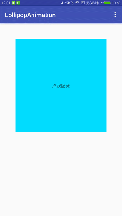
当需要显示或隐藏一组UI元素时,揭露动画可为用户提供视觉连续性。
- /* @param view The View will be clipped to the animating circle.要隐藏或显示的view
- * @param centerX The x coordinate of the center of the animating circle, relative to <code>view</code>.动画开始的中心点X
- * @param centerY The y coordinate of the center of the animating circle, relative to <code>view</code>.动画开始的中心点Y
- * @param startRadius The starting radius of the animating circle.动画开始半径
- * @param endRadius The ending radius of the animating circle.动画结束半径
- */
- public static Animator createCircularReveal(View view,
- int centerX, int centerY, float startRadius, float endRadius) {
- return new RevealAnimator(view, centerX, centerY, startRadius, endRadius);
- }
RevealAnimator和之前的动画使用没什么区别,同样可以设置监听器和加速器来实现各种各样的特效,该动画主要用在隐藏或者显示一个view,改变view的大小等过渡效果。
显示view:
- final TextView tv9 = (TextView) findViewById(R.id.tv9);
- findViewById(R.id.content_main).setOnClickListener(new View.OnClickListener() {
- @Override public void onClick(View v) {
- // get the center for the clipping circle
- int cx = (tv9.getRight() - tv9.getLeft()) / 2;
- int cy = (tv9.getBottom() - tv9.getTop()) / 2;
- // get the final radius for the clipping circle
- int finalRadius = Math.max(tv9.getWidth(), tv9.getHeight());
- // create the animator for this view (the start radius is zero)
- final Animator anim = ViewAnimationUtils.createCircularReveal(tv9, cx, cy, 0, finalRadius);
- tv9.setVisibility(View.VISIBLE);
- anim.start();
- }
- });
隐藏view:
- final TextView tv9 = (TextView) findViewById(R.id.tv9);
- tv9.setOnClickListener(new View.OnClickListener() {
- @Override public void onClick(View v) {
- // get the center for the clipping circle
- int cx = (tv9.getRight() - tv9.getLeft()) / 2;
- int cy = (tv9.getBottom() - tv9.getTop()) / 2;
- // get the final radius for the clipping circle
- int initRadius = Math.max(tv9.getWidth(), tv9.getHeight());
- // create the animator for this view (the start radius is zero)
- final Animator anim = ViewAnimationUtils.createCircularReveal(tv9, cx, cy, initRadius, 0);
- anim.addListener(new AnimatorListenerAdapter() {
- @Override public void onAnimationEnd(Animator animation) {
- super.onAnimationEnd(animation);
- // make the view visible and start the animation
- tv9.setVisibility(View.INVISIBLE);
- }
- });
- anim.start();
- }
- });
沿着中心缩小:
- Animator animator = ViewAnimationUtils.createCircularReveal(view, view.getWidth() / 2, view.getHeight() / 2, view.getWidth(), 0);
- animator.setInterpolator(new LinearInterpolator());
- animator.setDuration(1000);
- animator.start();
从左上角扩展:
- Animator animator = ViewAnimationUtils.createCircularReveal(view,0,0,0,(float) Math.hypot(view.getWidth(), view.getHeight()));
- animator.setDuration(1000);
- animator.start();
三、使用转场动画
效果图以共享元素的转场动画为例:
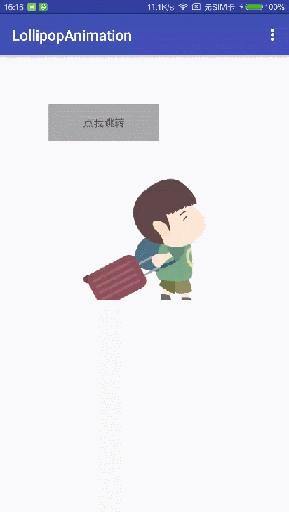
MaterialDesign应用中的操作行为转换透过通用元素之间的移动和转换提供不同状态之间的视觉连接。可为进入、退出转换以及操作行为之间的共享元素转换指定定制动画。在5.0之前,我们可以在startActivity之后调用overridePendingTransition来指定Activity的转场动画。
- 进入转换将决定操作行为中视图如何进入场景。例如,在分解进入转换中,视图将从屏幕外进入场景并飞往屏幕中心。
- 退出转换将决定操作行为中应用行为的显示视图如何退出场景。例如,在分解退出转换中,视图将从屏幕中心退出场景。
- 共享元素转换将决定两个操作行为转换之间共享的视图如何在这些操作行为中转换。 例如,如果两个操作行为拥有相同的图像,但其位置与大小不同,changeImageTransform共享元素转换将在这些操作行为之间平滑地转换与缩放图像。
Android 5.0(API Level 21)支持这些进入与退出转换:(普通过渡动画)
- 分解 - 从场景中心移入或移出视图。
- 滑动 - 从场景边缘移入或移出视图。
- 淡入淡出 - 通过调整透明度在场景中增添或移除视图。
也支持这些共享元素转换:(共享元素的过渡动画)
- changeBounds - 为目标视图的大小添加动画。
- changeClipBounds - 为目标视图的裁剪大小添加动画。
- changeTransform - 为目标视图的缩放、旋转和位移添加动画。
- changeImageTransform - 为目标图片的缩放、旋转和位移添加动画。
指定转场动画
要想使用新的转场动画,可以继承Material Design主题后在style风格中指定:
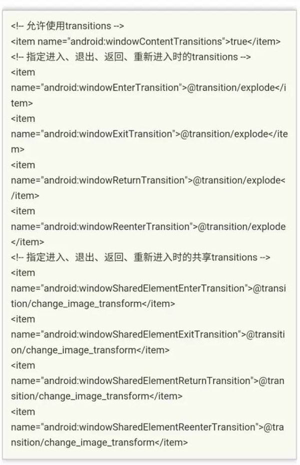
其中,change_image_transform定义如下:
- <!-- res/transition/change_image_transform.xml -->
- <!-- (see also Shared Transitions below) -->
- <transitionSet xmlns:android="http://schemas.android.com/apk/res/android">
- <changeImageTransform/>
- </transitionSet>
如果要带代码中开启窗口内容转换,需要调用Window.requestFeature()方法。

普通转场动画:
所有继承自visibility类都可以作为进入、退出的过度动画。如果我们想自定义进入和退出时的动画效果,只需要继承Visibility,重载onAppear和onDisappear方法来定义进入喝退出的动画。系统提供了三种默认方式:
- explode 从屏幕中心移入或移出视图
- slide 从屏幕边缘移入或移出视图
- fade 改变视图的透明度
想在xml中指定自定义的进入、退出的过度动画需要先对动画进行定义:
- <transition class="my.app.transition.CustomTransition"/>
注意:其中CustomTransition是我们自定义的动画,它必须继承自Visibility。
想以普通转场动画的方式启动一个Activity,必须在startActivity函数中传递一个ActivityOptions的Bundle对象:
- ActivityOptions options = ActivityOptions.makeSceneTransitionAnimation(activity);
- startActivity(intent, options.toBundle());
如果想让返回也具备转场效果,那么在返回的Activity中不要再调用finish函数,而是应该使finishAfterTransition来结束一个Activity,该函数会等待动画执行完毕才结束该Activity。
共享转场动画:
如果要在两个具有共享元素的Activity之间使用转场动画,那么:
1、在题中启用窗口内容转换。android:windowContentTransitions
2、在Theme中指定一个共享元素转换。
3、将transitions定义为xml资源。
4、利用 android:transitionName属性对两个布局中的共享元素指定一个通用名称。
5、使用 ActivityOptions.makeSceneTransitionAnimation()方法。
- // get the element that receives the click event
- final View imgContainerView = findViewById(R.id.img_container);
- // get the common element for the transition in this activity
- final View androidRobotView = findViewById(R.id.image_small);
- // define a click listener
- imgContainerView.setOnClickListener(new View.OnClickListener() {
- @Override
- public void onClick(View view) {
- Intent intent = new Intent(this, Activity2.class);
- // create the transition animation - the images in the layouts
- // of both activities are defined with android:transitionName="robot"
- ActivityOptions options = ActivityOptions
- .makeSceneTransitionAnimation(this, androidRobotView, "robot");
- // start the new activity
- startActivity(intent, options.toBundle());
- }
- });
如果要在代码中生成共享view,那么需要调用View.setTransitionName()方法对两个布局中的共享元素指定一个通用名称。
如果有多个共享元素,则可以通过Pair进行包装处理:
- ActivityOptions options = ActivityOptions.makeSceneTransitionAnimation(activity,
- Pair.create(view1, "name1"),//这里view1、view2如果是TextView或者ImageView等,需要转成View类型才可以
- Pair.create(view2, "name2"));
- startActivity(intent,.toBundle());
返回时如果需要具备转场动画,那么也需要用finish函数替代finishAfterTransition来结束一个Activity。
使用曲线运动
因为曲线运动和属性动画以及贝塞尔曲线这些东西混杂在一起,所以准备把这节拿出来单独写。这里就不多说了。
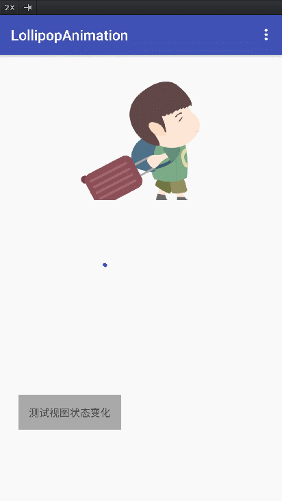
视图状态改变
Android 5.0在原有的图片选择器和颜色选择器上进行了增强,不仅是控件能根据不同的状态显示不同的背景图片,还能在两种状态切换时指定一个动画,来增加过渡效果,吸引用户眼球,以突出重点内容。
StateListAnimator类和图片选择器,颜色选择器类似,可以根据view的状态改变呈现不同的动画效果,通过xml我们可以构建对应不同状态的动画合集,其使用方式也非常简单,在对应的状态指定一个属性动画即可:
- <selector xmlns:android="http://schemas.android.com/apk/res/android">
- <item android:state_pressed="true">
- <set>
- <objectAnimator android:propertyName="translationZ"
- android:duration="200"
- android:valueTo="20dp"
- android:valueType="floatType"/>
- </set>
- </item>
- <item android:state_enabled="true" android:state_pressed="false">
- <set>
- <objectAnimator android:propertyName="translationZ"
- android:duration="200"
- android:valueTo="0"
- android:valueType="floatType"/>
- </set>
- </item>
- </selector>
代码中这样加载即可:
- TextView tv11 = (TextView) findViewById(R.id.tv11);
- StateListAnimator stateLAnim = AnimatorInflater.loadStateListAnimator(this,R.drawable.selector_for_button);
- tv11.setStateListAnimator(stateLAnim);
继承了Material主题后,按钮默认拥有了z属性动画。如果想取消这种默认状态,可以把状态动画指定为null。
除了StateListAnimator类指定状态切换的属性动画外,还可以通过AnimatedStateListDrawable来指定状态切换的帧动画:
- <animated-selector xmlns:android="http://schemas.android.com/apk/res/android">
- <item android:id="@+id/pressed" android:drawable="@drawable/btn_check_15" android:state_pressed="true"/>
- <item android:id="@+id/normal" android:drawable="@drawable/btn_check_0"/>
- <transition android:fromId="@+id/normal" android:toId="@+id/pressed">
- <animation-list>
- <item android:duration="20" android:drawable="@drawable/btn_check_0"/>
- <item android:duration="20" android:drawable="@drawable/btn_check_1"/>
- <item android:duration="20" android:drawable="@drawable/btn_check_2"/>
- </animation-list>
- </transition>
- </animated-selector>
帧动画的资源文件直接在xml中作为view的background即可。
四、矢量图动画
效果图:
先在drawable中定义一张矢量图:
- <?xml version="1.0" encoding="utf-8"?>
- <vector xmlns:android="http://schemas.android.com/apk/res/android"
- android:height="200dp"
- android:width="200dp"
- android:viewportHeight="400"
- android:viewportWidth="400">
- <group
- android:name="rotationGroup"
- android:pivotX="0"
- android:pivotY="0">
- <path
- android:name="star"
- android:pathData="M 100,100 h 200 l -200 150 100 -250 100 250 z"
- android:strokeColor="@color/colorPrimary"
- android:strokeLineCap="round"
- android:strokeWidth="10"/>
- </group>
- </vector>
然后在anim中定义动画:
- <?xml version="1.0" encoding="utf-8"?>
- <set xmlns:android="http://schemas.android.com/apk/res/android">
- <objectAnimator
- android:propertyName="trimPathStart"
- android:valueFrom="0"
- android:valueTo="1"
- android:valueType="floatType"
- android:duration="2000"
- android:repeatMode="reverse"
- android:repeatCount="-1"
- android:interpolator="@android:interpolator/accelerate_decelerate"/>
- </set>
***在drawable中定义一个animated-vector:将动画资源指定给drawable属性值的矢量图。
- <?xml version="1.0" encoding="utf-8"?><animated-vector xmlns:android="http://schemas.android.com/apk/res/android"
- android:drawable="@drawable/vector_drawable">
- <target
- android:name="star"
- android:animation="@anim/animation"/></animated-vector>
注意:这里drawable属性值是前面我们定义的矢量图,target中name要和矢量图中path的name一样,animation就是前面定义的动画资源文件。
在view的xml中使用以及在代码中开始动画:
- <ImageView
- android:id="@+id/iv"
- android:layout_width="wrap_content"
- android:layout_height="wrap_content"
- android:layout_margin="20dp"
- app:srcCompat="@drawable/anim_vector_drawable"
- android:layout_gravity="center"/>
- ImageView iv = (ImageView) findViewById(R.id.iv);
- Drawable drawable = iv.getDrawable();
- if (drawable instanceof Animatable) {
- ((Animatable) drawable).start();
- }